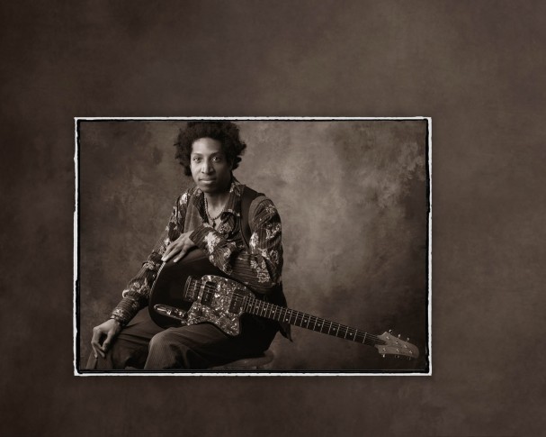
Simple and clean is the philosophy that has been the cornerstone of award-winning veteran photographer Tim Kelly’s success. Kelly’s philosophy is perfectly illustrated with this Sunset Print Award-winner, a portrait of up and coming singer/songwriter musician Billy Wright.
Kelly won a Sunset Print Award for Billy Wright’s portrait at the recent Florida Professional Photographers competition. Billy Wright’s portrait is not flashy, but each technical element is spot-on, something the judges could not possibly overlook.
“At the state competition, it was one of about 40 prints entered out of a total of around 400 images. They judged the prints first, and I can tell you from competing for 30 years that you don’t want your prints judged in the first round, because the judges haven’t found their set point and they’re very conservative early on,” says Kelly. “Getting through the first round is a good thing, especially when you’re doing work that’s not high-impact or snazzy, but is just clean. It was ultimately selected as best print of the show.”
During the session, Kelly shot black-and-white film, 4×5 film and digital, selecting one of the 4×5 shots to add to his portfolio and enter in competition. It was a back-to-basics portrait session, but all of Kelly’s portrait photography is about the doing the basics well.
“I don’t make a habit of manipulating my images, even though I’ve been doing Photoshop since the first version came out. I make sure that my look doesn’t include any trendy, faddish elements. I try to go with a stock, clean, unaffected image,” explains Kelly. “I scanned the film, touched up his face a little bit and made my image for my portfolio and competition. Simplicity proves itself when you let it. When you have the fidelity the film can give, and then making the perfect print myself, it gives me quite an edge.”
Kelly also took great care to ensure that the overall presentation with the digital border elements he created would not distract from the subject matter. Again, clean and simple is what he strives for in his work.
“I try and make sure the tonal value of the border corresponds to and enhances the existing background. I never want to throw in new textures and densities when I want your eye to go to the subject. Where do you want me to look if I’m the viewer? Don’t distract me with other pinstripes and design elements,” says Kelly. “This is just a digital add of photo edges and a background tone pulled out of the image, which I printed with a sepia feel. I’ve been a fan of warmer black and white for portraits. I don’t sell, produce or enter cold-toned black-and-white photos. I photograph people, and people need some kind of warmth.”


