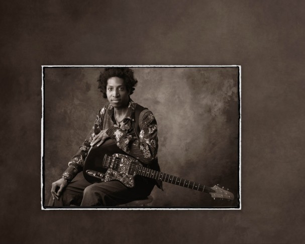
Simple and clean is the philosophy that has been the cornerstone of award-winning veteran photographer Tim Kelly’s success. Kelly’s philosophy is perfectly illustrated with this Sunset Print Award-winner, a portrait of up and coming singer/songwriter musician Billy Wright.
Category: Billy Wright
Posted on
by
Regan Dickinson
Posted in
Sunset Print Award,
Photography Competition,
Print Competition,
Billy Wright,
Sunset,
Case Studies & Profiles,
Florida Professional Photographers,
Tim Kelly,
studio photography,
Portrait Photography,
Photography
Leave a comment
Prints that Win: Billy Wright
Recent Posts
- Explore New Cutting-Edge Photo and Fine Art Printing with Epson® July 10, 2025
- Glow Up Your Graphics with Holographic Vinyl Magic June 26, 2025
- A First of Its Kind: The Print That Made History in Photography Competition June 24, 2025
- Better Together: Tackle Demanding Installs with This Powerful Duo June 19, 2025
- Fly High with Durable, Eye-Catching UFABRIK Flag Textiles June 17, 2025
Categories
- 3 Mil Gloss UV Premium Low Melt (1)
- 3 Mil Gloss UV Premium Low Melt Laminate (1)
- 3D (1)
- 3D graphics (1)
- A Bridge to Remember (1)
- A Slow Decline (1)
- Aaron Thomason (1)
- AB Photography (1)
- Abstract Art (1)
- Abstract Art Prints (1)
- Accent Lighting (1)
- Acetate (1)
- Acrylic (1)
- Adhesive Backed Fabric (1)
- Adobe Illustrator (1)
- Advertising (2)
- Alon Weiner (1)
- Amanda Crow (1)
- amateur photographer (1)
- Amelia Island (2)
- American Photographic Artists Guild (2)
- Amesbury (1)
- Amy Feick (1)
- Andrea Joliat (1)
- Andrea Phox (1)
- Andrew Jenkins (2)
- Andy Wredberg (1)
- Angela Blankenship (1)
- Angels Bending Near the Earth (1)
- Animal Photography (2)
- Anita Hopper (1)
- Ann Naugher (2)
- anti-bullying (1)
- anti-bullying initiative (1)
- anti-bullying video (1)
- Anti-Graffiti (1)
- Antonelli Institute (1)
- Antonelli Institute of Graphic Design & Photog (1)
- Antonelli Institute Print Competition (1)
- Aperture (1)
- Apparel Printing (1)
- Application (2)
- Application Guide (2)
- Aqueous Inkjet Printers (1)
- Aqueous Printer (1)
- aqueous printing (1)
- Arc Studios Photography (1)
- Architecure (1)
- archival paper (1)
- Arizona Thunder (1)
- Arkansas Professional Photographers Association (1)
- Armonk (1)
- Art (1)
- Art by Cheri (2)
- Art Exhibit (2)
- Art Exhibitions (2)
- Art Foundry International (1)
- Art Printing (1)
- Art Reproduction (2)
- Art Reproductions (1)
- AS Long As One Man Believes (1)
- Ashton Elementary (1)
- Astrophotography (1)
- Atlas Distributing Inc. (1)
- Audrey Wancket (1)
- Autopano Pro (1)
- Autumn Cascades (1)
- Avant Printing (1)
- Avatrex (1)
- AW Artworks (1)
- Award Show Backdrop (1)
- Award Show Graphics (1)
- Award Winning Photography (1)
- Award Winning Print (1)
- Babcock State Park (1)
- Baby Boo Photography (1)
- Baby Photography (1)
- Backgrounds (1)
- Backgrounds by Maheu (1)
- Backlit (1)
- Backlit Prints (1)
- Banner Applications (1)
- Banner Finishing (2)
- Banner Stand Graphics (1)
- Banner Stands (2)
- Banners (2)
- Bar Mitzvah (1)
- Barn-Door (1)
- Basic Mode Settings (1)
- Basketball Court (1)
- Beartooth Photography (1)
- Beer (2)
- Beer Distributor (1)
- Behlmann Digital (1)
- Ben Shirk (1)
- Ben Tanzer (1)
- Best in Show (1)
- Best Print in Show (1)
- Beverage Barn (1)
- Beverage Distribution (1)
- Beverage Distributor (2)
- Beyond the Lens (4)
- Big Sqeegee (1)
- Bill Barley (1)
- Bill Barley & Associates (1)
- billboard (1)
- billy d photography (1)
- billy dzwonkowski (1)
- Billy Wright (1)
- Bird Dog Distributing (1)
- bird illustrations (1)
- Black and White (1)
- Black and White Photography (3)
- Black Friday Deal (1)
- Black Friday Sale (1)
- Blackfoot (1)
- Blowing Out of a Creative Funk (1)
- Blue Moon (1)
- Bob Klein (1)
- Boise (1)
- Bombshell (2)
- Bonnaroo Music & Arts Festival (1)
- Bonnie and Clyde (1)
- Branding (4)
- BREA Photos (1)
- Brent Lee (1)
- Brett Feldman (1)
- Brian Killian (1)
- Brian Rogers (2)
- brick surfaces (1)
- Brookfield (1)
- bryan allen (1)
- Bumblejax (1)
- Burg Photographix (1)
- Burma (1)
- Business (1)
- buy LexJet online (1)
- BWC (2)
- CAD (1)
- California (2)
- California Photographer (1)
- Camera (2)
- Canfield Jenkins House of Photography (1)
- Canon (30)
- Canon 1D X (1)
- Canon 7D (2)
- canon colorado (3)
- Canon Colorado M-Series (1)
- Canon EOS 5D Mark II (1)
- Canon EOS 5D Mark III (1)
- Canon EOS 60Da (1)
- Canon EOS-1Ds Mark III (1)
- Canon imagePROGRAF (3)
- Canon imagePROGRAF PRO-4100 (1)
- Canon iPF 6350 (1)
- Canon iPF Printers (1)
- Canon iPF5100 (1)
- Canon iPF6100 (2)
- Canon iPF6400S (1)
- Canon iPF8000S (2)
- Canon iPF8100 (1)
- Canon iPF8300 (7)
- Canon iPF8300S Inkjet Printer (1)
- Canon iPF9400 (1)
- Canon Printer Rebates (1)
- Canon PRO-4000 (1)
- Canon PRO-series (1)
- Canvas (5)
- canvas art (1)
- Canvas Coating (1)
- Canvas Corner Folds (1)
- Canvas Demonstration Video (1)
- Canvas Gallery Wrap (1)
- Canvas Gallery Wraps (4)
- Canvas Inkjet Printing (1)
- Canvas Paper (1)
- Canvas Photo Paper (1)
- Canvas Print (1)
- Canvas Print Production (1)
- Canvas Printing (6)
- Canvas Prints (2)
- Canvas Sale (1)
- Canvas Stretch Master (1)
- Canvas Stretcher Bars (1)
- Canvas Stretching (1)
- Cape Cod (1)
- Carey Masera (1)
- Carlisle (1)
- Carpet Graphics (1)
- Case Studies & Profiles (149)
- Case Studies & Profiles (1)
- Cash In & Trade Up (1)
- Castle (1)
- Cat Photo (1)
- Catherine Sebastian (1)
- Cathleen Broderick Photography (1)
- Cathy Broderick (1)
- Cave City (1)
- Center on Contemporary Art (1)
- Certified Professional Photographer (3)
- Certified Professional Photographers (1)
- CET Color X-Press (1)
- chalk art (1)
- Change-Seed (1)
- Chaotic Profiling (1)
- Cher Sailer (1)
- Cheri Hammon (1)
- Cheri MacCallum (2)
- Cherished Images (1)
- Chicago (1)
- Chris Anderson (1)
- Chris Orwig (1)
- Chris Shigley (1)
- Chris Smith (1)
- Christie Kline (1)
- Christine Cook (2)
- Christmas (1)
- Christmas Cards (1)
- Christmas ornaments (1)
- ChromaLuxe (1)
- Church of the Land (1)
- Church Photo (1)
- Cindy Strupp (1)
- CJV330-130/-160 (1)
- Clarksville (1)
- Classic Car Photography (1)
- classic portrait (1)
- Classical Portrait Photography (1)
- Clay Blackmore (1)
- Clearcoating Canvas (1)
- ClearStar Coating (1)
- Cleveland (1)
- Cleveland Plain Dealer (1)
- click and win (1)
- CNC Router (1)
- Coatings (1)
- coatings for canvas (1)
- CoCA (1)
- Cody (1)
- Colonial Beverage (2)
- Color Checkers (1)
- Color Efex Pro (1)
- Color Gamut (4)
- Color Management (1)
- Color Management Software (1)
- ColorBurst (1)
- ColorMunki Photo (1)
- Commemorative Air Force Minnesota Wing (1)
- Commercial Decor Printing (2)
- Commercial Photography (3)
- Commonwealth Photography (1)
- compact printers (1)
- Competition (12)
- Competition Lighting (1)
- Competition Photography (2)
- Competition Printing (8)
- Concours D'Elegance (1)
- concrete (1)
- confederate soldier (1)
- Cooler Wrap (2)
- Coors (1)
- Coors Light (1)
- Corel Paint (2)
- Corel Painter (6)
- Corona (1)
- Coroplast (1)
- Corplast (1)
- Corporate Apparel and Printing (1)
- corporate design (1)
- Corporate Graphics (1)
- Cotton Rag (1)
- Covington (1)
- Creative Cards by Linda (1)
- CTPPA (1)
- Curves of Iris (1)
- Custom Decor (1)
- Custom Frame Shop (1)
- Custom Framed Artwork (1)
- Custom Inkjet Printing (1)
- Custom SEG frames (3)
- Custom Wall Art (3)
- custom wall mural (1)
- Custom Wallcoverings (2)
- Custom Wallpaper (2)
- Customer Experience (2)
- Customer Service (1)
- Customizable framing systems (1)
- customized gifts (1)
- customized wall paper (1)
- D&K 6 Mil UV Textured Vinyl PSA (1)
- Dali Lama (1)
- Dallas (4)
- Dalton (1)
- Dan Johnson (1)
- Dan Johnson Photography (1)
- Dana Shaffer (1)
- Dance Floor (1)
- Darrell Moll (1)
- Dave Hall (1)
- David Hedges (1)
- David Hyttsten (1)
- David Jeffery (1)
- David Maheu (1)
- David Raszka (1)
- David's Photography (1)
- Dawn Muncy (1)
- DCG Digital Color Graphics (1)
- DDS (1)
- Debra King (1)
- Deckled Edges (1)
- Decor Printing (5)
- DeCrescente Distributing (1)
- Delivery (1)
- Deltona (1)
- Demonstration (1)
- Dennis Hammon (2)
- Dennis the Menace (1)
- Departing Flight (1)
- Depth of Field (1)
- Design (2)
- Designjet 5500 (1)
- Desktop UV Printer (2)
- Detroit (1)
- Diageo (1)
- Dick Bennett Photography (1)
- Digital (1)
- Digital Art (2)
- Digital Art Creation Magazine (1)
- Digital Art Summit (1)
- Digital Artwork (1)
- Digital Fine Art (1)
- Digital Output (1)
- Digital Output Top 50 Readers' Choice Awards (1)
- Digital Painting (2)
- Digital Painting Techniques (1)
- Digital Photography (3)
- digital printing (5)
- Digital Printmaking (1)
- Digital Sports Photography (1)
- digital wallcovering (1)
- digital wallcoverings (2)
- digital wallpaper (1)
- digitally printed fabric (1)
- digitally printed textiles (2)
- Dimensional Signage (1)
- Dimpled Rock (1)
- Dipsy Daisy (1)
- Discount Canvas (1)
- Display (2)
- Display Graphics (1)
- DIY products (3)
- Dmax (1)
- DockDogs (1)
- Dog Photography (1)
- DPI 2014 (1)
- DPI-SIG of Naples Camera Club (1)
- Dream Copy Photo (1)
- Dream World (3)
- Dry Application (1)
- Dual-Array PrecisionCore® TFP® print heads (1)
- Dublin (1)
- Duncan MacNab (1)
- Duotone Images (1)
- dye-sub fabrics (2)
- Dye-Sub Printer (2)
- Dye-Sub Printing (3)
- dye-sub transfer (1)
- dye-sublimation printer (4)
- Dynamite Prices (1)
- Décor (4)
- Earth Day (1)
- Easy to Install Wraps (1)
- Eckley Miners' Village (1)
- Eco Solvent Printers (1)
- eco-friendly (2)
- eco-friendly window film (1)
- eco-solvent inks (1)
- Eco-Solvent Printer (2)
- Eddie Tapp (2)
- edge points (1)
- Editorial (1)
- Educational Graphics (1)
- Edwin Church (1)
- EFI (6)
- EFI 32r+ (1)
- EFI Customer Experience Center (2)
- EFI Ignite (1)
- efi pro 16H (1)
- EFI Pro 32r+ Printer (1)
- EFI VUTEk FabriVU 340i+ (2)
- efi wide format printers (3)
- Elaine Hughes (3)
- Electronic Imaging (1)
- Elements Portfolio (2)
- Elizabeth Ashford (1)
- Elizabeth Ellenwood (1)
- Elizabeth Van den Boeck (1)
- Elizabeth's Art Gallery (1)
- Ellwood T. Risk (1)
- Encaustic Painting (1)
- Encore Editions (1)
- End of the Line (1)
- Environmentally Friendly Printing (1)
- ePrinter (1)
- Epson (37)
- Epson 11880 (1)
- Epson 3880 (1)
- Epson Dye-Sub (3)
- Epson dye-sublimation printer (3)
- Epson eco-solvent (1)
- Epson education (1)
- Epson F170 (3)
- epson f570 (4)
- Epson F9470 (1)
- Epson P-Series printers (2)
- Epson Premium Luster Photo Paper (1)
- Epson printer (5)
- Epson printer rebates (1)
- Epson printer review (1)
- epson r-series (2)
- Epson S-Series (1)
- Epson S40600 (2)
- Epson S60600 (2)
- Epson S80600 (2)
- Epson solvent printer (3)
- Epson Stylus Pro 11880 (2)
- Epson Stylus Pro 3880 (3)
- Epson Stylus Pro 7800 (2)
- Epson Stylus Pro 7900 (1)
- Epson Stylus Pro 9800 (1)
- Epson Stylus Pro 9900 (4)
- Epson Stylus Pro GS6000 (1)
- Epson Stylus Pro Inkjet Printer (1)
- Epson SureColor (3)
- Epson SureColor P-Series (1)
- Epson SureColor Printer (2)
- Epson SureColor Printers (2)
- Epson SureColor R5070L (2)
- Epson SureColor S-Series (3)
- Epson SureColor S30675 (1)
- Epson SureColor S50675 (1)
- Epson SureColor S60600 (1)
- Epson SureColor S70670 (1)
- Epson SureColor S70675 (1)
- Epson SureColor S80600 (2)
- Epson SureColor S9170 (1)
- Epson SureColor T-Series Inkjet Printers (1)
- Epson SureColor V1070 (2)
- Epson T Series Printer (1)
- Epson T-Series Printers (1)
- Epson Technical Printers (1)
- Epson UltraChrome (1)
- Epson UltraChrome Ink (1)
- Epson webinar (1)
- Erdenheim (1)
- Eric Hopper (1)
- esatin (1)
- Evening Mist (1)
- Event (1)
- Event Graphics (1)
- Exhibition (1)
- Expand Banner Stand (1)
- Expand Banner Stands (1)
- Exposure (1)
- External window graphics (1)
- Fabric (2)
- fabric banner (1)
- Fabric Banners (2)
- Fabric Printing (3)
- Fabric Prints (1)
- Face Mount Acrylic (1)
- FaceMount Perforated Window Graphics (1)
- Family Portrait (1)
- Family Portraits (1)
- February (1)
- February printer rebates (1)
- Feeling out of Place (1)
- Fibre Based (1)
- Fibre Based Inkjet Paper (1)
- Field Museum (1)
- Film (1)
- Film Noir (1)
- Filter (1)
- Find a Printer on a Network (1)
- Fine Art (8)
- Fine Art of Photography (3)
- fine art paper (6)
- Fine Art Papers (1)
- fine art photographs (1)
- Fine Art Photography (4)
- Fine Art Portrait Photography (4)
- Fine Art Print (1)
- Fine Art Printing (3)
- Fine Art Printmaking (1)
- Fine Art Prints (3)
- Fine Art Reproduction (6)
- fine art reproductions (2)
- Finishing (3)
- Firehole River (1)
- Firmware (1)
- Fischer Photography (1)
- Flags (2)
- Flamingo Hotel (1)
- Flatbed Printer (1)
- Flatbed Printing (2)
- Fleet Graphics (1)
- Flexible Media (1)
- FlexiSIGN (1)
- Floor Graphics (5)
- Florida (2)
- Florida Camera Clu (1)
- Florida Camera Club Council (1)
- Florida PPA (1)
- Florida Professional Photographers (3)
- Flow Photography (1)
- flower photography (1)
- FLXfinish+ (1)
- Fonthill Castle (1)
- Football (1)
- Fort (1)
- Fort Plain (1)
- fpp (1)
- Framed Art (1)
- Frames (1)
- Fredrix (1)
- Fredrix 901SJ Select Matte Canvas (1)
- Fredrix canvas (1)
- Fredrix Metallic Gold (1)
- Fredrix Metallic Pearl (1)
- Free Download (1)
- Free Webinars (2)
- Fresnel (1)
- Fuji X-T1 (1)
- Galaxies (1)
- Gallery (1)
- GAPP Engineering (1)
- Garith Rockliffe (1)
- Gary Kellner (1)
- Gary Meek (2)
- Gary's Studio of Photography (1)
- Gator Board (2)
- General Formulatins (1)
- General Formulations (4)
- General Formulations 831 AutoMark™ Cast Gloss Clea (1)
- General Formulations RoughMark™ 285 (1)
- Genuine Fractals (1)
- Georgia (2)
- Georgia PPA (1)
- Georgia Professional Photographers Association (2)
- German Etching 310 (1)
- Gettysburg (1)
- GF 226 WallMark Vinyl (1)
- GF AutoMark Cast With Drift (1)
- GF Automark High Gloss Clear UV Cast Laminate (1)
- GF Cast Vinyl (2)
- GF Rainbow Holographic Film (1)
- GF RoughMark 285 (1)
- GF RoughMark 885AE (1)
- GF Sparkle Holographic Film (1)
- Ghost Town in the Sky (2)
- gift giving (1)
- GLI (1)
- Gloss (1)
- Gloss Print (2)
- go-to products (1)
- GOframe (1)
- Golden Arches (1)
- Golf Course Landscape Photography (1)
- Golf Course Photography (1)
- Golf Course Prints (1)
- Gordon (1)
- Gordon Kreplin (1)
- Government Graphics (1)
- Grand Rapids (1)
- Grand Teton National Park (1)
- Granite (1)
- Graphic Art (1)
- Graphics (2)
- Graphics Lamination (1)
- graphtec (1)
- Greater Louisville Inc. (1)
- Greenbush (1)
- Greeting Cards (1)
- Greg Doucet (1)
- Gregory Georges (1)
- Grellner Sales & Service (1)
- Gretchen Carter (1)
- Grist Mill (1)
- Guide (1)
- Guinness (1)
- Hahnemuhle (5)
- hahnemuhle canvas (1)
- Hahnemuhle FineArt Baryta (2)
- Hahnemuhle paper (2)
- Hahnemuhle Photo Rag (1)
- Hahnemühle fine art paper (2)
- hand roll coating (1)
- handbag design (1)
- hard surfaces (1)
- Hare Apparent (1)
- Harmony and Nick Portrait Artists (1)
- Harmony Jones (1)
- Harp (1)
- Harry Potter (1)
- Harvard Press (1)
- Hasselblad (1)
- Hayes and Fisk (1)
- HDR (1)
- HDR Photography (1)
- Head Cleaning (1)
- heat press (1)
- Heather Storm (1)
- Heineken (1)
- High Quality Inkjet Photo Paper (1)
- High School Seniors (1)
- High Volume Wide Format Printing (2)
- Historical Photographs (1)
- hobbyist (1)
- holiday photo papers (1)
- Holidays (1)
- Home Decor (2)
- Hong Kong Umbrella Revolution (1)
- Hopkins Fine Portraits (1)
- hospitality decor (1)
- Hot One Awards (1)
- How To (5)
- How to Apply Window Graphics (1)
- How To Coat Canvas (1)
- How To Troubleshoot Lamination (1)
- How To Videos (1)
- how-to tips (3)
- Howard Studios (1)
- HP (11)
- HP Designjet L26500 Latex Inkjet Printer (1)
- HP Designjet Z5400 PostScript ePrinter (1)
- HP INstant Printing PRO (1)
- HP L25500 Latex Printer (1)
- HP Latex 210 (1)
- HP Latex 260 (1)
- HP Latex 280 (1)
- HP Latex 300 Series (1)
- HP Latex 3000 (1)
- HP Latex 360 (1)
- HP Latex 630W (1)
- HP Latex 730W (1)
- HP Latex 800 Series (2)
- HP Latex 830 (1)
- HP Latex Inks (3)
- HP Latex Print & Cut (1)
- HP Latex Printer (4)
- HP Latex Printer Applications (3)
- HP Latex Printers (5)
- HP Latex printing (7)
- HP Latex Printing Technologies (2)
- HP Latex R530 (1)
- HP Light Fabric (1)
- HP Multi-Dimensional Smart Drop Placement (1)
- HP Photo Inks (1)
- HP Photo-realistic Poster Paper (1)
- HP Premium Clear Window Film (1)
- HP Premium Poster Paper (1)
- HP Prime Gloss Air GR (1)
- HP Printer Rebates (1)
- HP PVC-free Durable Smooth Wall Paper (1)
- HP PVC-free Wall Paper (1)
- HP Technology (1)
- HP Upgrade to Latex (1)
- hp white ink (2)
- HPLV (1)
- hybrid printer (2)
- Hydrogen-Alpha Lines (1)
- I.T. Strategies (1)
- i1Display Pro (1)
- i1Profiler (1)
- Icebound Anomaly (1)
- Idaho (2)
- Idaho Falls (2)
- illustrative (1)
- Illustrator (1)
- image awards (1)
- image competition (1)
- ImagePrint (2)
- ImagePrint RIP (3)
- imagePROGRAF (1)
- imagePROGRAF Firmware Update Tool V24.00 (1)
- images printed on leather (1)
- Imaging USA (1)
- Impact Photography (1)
- In Flight with Twigs (1)
- In House Printing (2)
- Inc.credible Awards (1)
- Indoor Display Graphics (1)
- Indoor Graphics (1)
- Inffeed Waves (1)
- Ink (2)
- Ink Drying on Print (1)
- Inkjet (2)
- Inkjet Canvas (4)
- Inkjet Canvas Collage (1)
- Inkjet Cartridge Recycling (1)
- Inkjet Fabric (2)
- Inkjet Graphics (1)
- Inkjet Media (3)
- Inkjet Photo Paper (1)
- Inkjet Printer (9)
- Inkjet Printers (3)
- Inkjet Printing (58)
- Inkjet Printing Tips (1)
- Inkjet Wall Murals (1)
- Inkjet Wallpaper (1)
- Innovation (1)
- Instagram (1)
- Installation Guide (1)
- Instant Rebate (1)
- Instructional Videos (1)
- Interior Decor (1)
- Interior Design (3)
- Intermountain Professional Photographers Associati (1)
- international print competition (2)
- Internet (1)
- IP Address (1)
- iPad Promotion (1)
- iPF (1)
- iPF Printers (1)
- iPF5100 (1)
- iPF6100 (1)
- iPF6300 (1)
- iPF6350 (1)
- iPF8000S (1)
- iPF8300 (1)
- iPF9000S (1)
- iPF9100 (1)
- ISO (1)
- It Was the Best of Times (1)
- Ivey Photography (1)
- Jackson Pollock (1)
- Jaki Good Miller (1)
- Jaki Miller (1)
- James Audubon (1)
- James Steinmetz (1)
- James Trapp (1)
- Jamie Birch (1)
- Jamie Steeno (1)
- Janine Peters Killian (1)
- Jeff Behlmann (1)
- Jeff Bowman (1)
- Jeff Dachowski (1)
- Jeff Gulle (4)
- jennifer Palumbo (1)
- Jerry Ghionis (1)
- Jerry Lodriguss (1)
- Jessup Floor Graphics (2)
- JetFlex FL Matte (1)
- Jewel Images (1)
- Jim Trapp (1)
- John Gladman (1)
- Jon Scott (1)
- Jonathan Penney (3)
- Jonathan Penney Inc. (1)
- JPEG (1)
- JS Graphics (1)
- judging (1)
- Julia Kelleher (1)
- June Greenspan (1)
- Kara Work (1)
- Karen Peters (1)
- Kari Douma (3)
- karidouma (1)
- karidoumappa (1)
- Kathryn Meek (1)
- Kathy Meek (1)
- Keder tape (2)
- Kelly Price (1)
- Kelly Schulze (3)
- Kelly Willis (1)
- Kelly Zimmerman (1)
- Ken Stoecklin (1)
- Kenny King (1)
- Kentucky (2)
- Kentucky Professional Photographers Association (1)
- Kevin Kubota (1)
- Kidnapped by Tuscan Fog (1)
- kim smith (1)
- kimberly j smith (1)
- kimberly smith (1)
- Kodak (1)
- Kodak Gallery Elite Award (1)
- KODAK PROFESSIONAL Inkjet Photo Paper Luster Finis (1)
- Kristi Elias (3)
- Kristi Sutton Elias Photography (2)
- Kroger (1)
- Kroger History (1)
- Kung POW Chicken (2)
- La Petite Mademoiselle (1)
- Lab (1)
- Laminate (1)
- Laminating (2)
- Lamination (1)
- Laminator (1)
- lamp shades (1)
- Landscape (1)
- Landscape Photography (4)
- Large Format (1)
- Large Format Printing (1)
- Larry Peters (1)
- Latex (3)
- Latex Inkjet Printer (1)
- Latex Inks (1)
- latex media (1)
- Latex Printer (1)
- Latex Printers (3)
- Latex Printing (1)
- latex printing technology (3)
- Latex Squid (1)
- Latex window film (1)
- Laura Wagoner (1)
- Lauren Driscoll (1)
- Lebanon (1)
- LED (1)
- LED Lighting (1)
- LED production printer (1)
- Lens (1)
- Lexington (1)
- LexJet (94)
- LexJet 11 Mil Blockout Water-Resistant Polypropyle (1)
- LexJet 3 Mil Matte UV Standard Low Melt (1)
- LexJet 5 Mil Gloss Display Film (1)
- LexJet 5.5 Mil Matte Opaque Display Film (1)
- LexJet 8 Mil ImagePro Gloss (1)
- LexJet 8 Mil ImagePro Satin (1)
- LexJet 8 Mil Production Satin Photo Paper (1)
- LexJet Aqueous Perforated Vinyl (2)
- LexJet Blizzard Outdoor Stand (1)
- LexJet Blog (2)
- LexJet booth (1)
- LexJet Clear PreLume HD (1)
- LexJet Crystal Low-Tack (1)
- LexJet Customer Specialist (1)
- LexJet Customer Stories (1)
- LexJet Edge (2)
- LexJet FaceMount Permanent Adhesive (1)
- LexJet FaceMount-X Removable Adhesive (1)
- LexJet Floor Velvet Laminate (5 Mil) (1)
- LexJet GraphicMount White Adhesive (1)
- LexJet Heavy Duty Banner Tape (2)
- LexJet Instant Dry Canvas (1)
- LexJet Instant Dry Clear Polyester (2)
- LexJet Poly Select (1)
- LexJet Poly Select Blockout Fabric (2)
- LexJet Poly Select Fabric (1)
- LexJet Poly Select Heavy (1)
- LexJet Poly Select Medium (1)
- LexJet Premium Archival Matte (1)
- LexJet Premium Archival Matte Paper (1)
- LexJet Print-N-Stick (1)
- LexJet Print-N-Stick Fabric (6)
- LexJet printer sale (1)
- LexJet sale (1)
- LexJet Satin Light Block Polyester (1)
- LexJet Simple Adhesive Vinyl SUV (1)
- LexJet Simple CarpetAd (1)
- LexJet Simple Flo Wrap Gloss UV Laminate (1)
- LexJet Simple Flo Wrap Vinyl (2)
- LexJet Solvent Print-N-Stick Fabric (1)
- LexJet Sunset (3)
- LexJet Sunset Award (29)
- LexJet Sunset Fibre Elite (2)
- lexjet sunset fibre rag (1)
- LexJet Sunset Fine Art Papers (1)
- LexJet Sunset Hot Press Rag (1)
- LexJet Sunset Hot Press Rag 310g (1)
- LexJet Sunset Photo eSatin Paper (2)
- LexJet Sunset Photo Metallic Paper (4)
- lexjet sunset print award (2)
- LexJet Sunset Print Awards (1)
- LexJet Sunset Production Matte Canvas (1)
- LexJet Sunset Reserve Bright Matte Canvas (2)
- LexJet Sunset Stretcher Bars (1)
- LexJet Sunset Velvet Rag (1)
- LexJet Sunset Velvet Rag SUV (1)
- LexJet TOUGHcoat (1)
- LexJet TOUGHcoat 3R DuPont Tyvek (1)
- LexJet TOUGHcoat Water-Resistant Polypropylene (1)
- LexJet TOUGHcoat Water-Resistant Self Adhesive Pol (1)
- LexJet Video (2)
- lexjet webinars (1)
- LexJet YouTube Vidoes (1)
- Light (1)
- Lighting (2)
- Lightroom (2)
- Linda Dahlberg (1)
- Linda Guy (1)
- Lintec (3)
- Lintec Window Film (3)
- liquid coating (1)
- Liquid lamination with roller (1)
- Lisa Cuchara (1)
- Little Miss Muffet (4)
- Little Red Riding Hood (1)
- Live Event Graphics (1)
- Living History Farms (1)
- Loius Brevetti (1)
- London Tavern (1)
- Long Beach (1)
- Low Solvent (1)
- Low Solvent Printer (1)
- Lowell's Boat Shop (1)
- Lowell's Boat Shop Workroom Door (1)
- Lumix Digital Single Lens Mirrorless Camera (1)
- Luster (1)
- Luster Laminate (1)
- Lytro (1)
- Maasai Mara Project (1)
- Mac (1)
- Macone (1)
- Macrophotography (1)
- mactac (1)
- Madison (1)
- Maggie Valley (1)
- Mail In Rebate (1)
- Makeshift (1)
- Maldives Canvas (1)
- Manchester (1)
- Map Printing (1)
- Marabu ClearShield (1)
- Marabu ClearShield Anti-Graffiti (1)
- Marabu Coating (3)
- Marabu coatings (1)
- Marabu Products (5)
- Marco Ferrero (1)
- Mark Bryant (1)
- Marketing (4)
- Marketing & Sales (15)
- Marketing Photography (1)
- Mary Fisk-Taylor (1)
- Massachusetts (1)
- Master Artist (4)
- Master of Photography (1)
- master photographer (3)
- Matt (1)
- Matt Baxter (1)
- Matte (1)
- McKay Photography Academy (1)
- MediaScreen (1)
- Melissa Jean Photography (2)
- Melissa Jeffcoat (2)
- Melissa Thompson (1)
- Mercer Museum (1)
- Merrimack River (1)
- Metal (1)
- metallic paper (1)
- Metallic photo paper (1)
- metallic silver ink (1)
- michael novo (1)
- Michael Timmons (7)
- Michael Zerivitz (1)
- Michigan (4)
- michigan ppa (1)
- Mike's Hard Lemonade (1)
- MillerCoors (1)
- Mimaki (8)
- Mimaki 330 (1)
- Mimaki Entry-Level Printers (1)
- Mimaki JFX600-2513 (1)
- Mimaki JV100-160 Printer (1)
- Mimaki JV330 (1)
- Mimaki LA-160W (1)
- Mimaki Laminators (1)
- Mimaki printers (4)
- Mimaki UCJV300 Print and Cut Printers (2)
- Mimaki UCJV300-160 (3)
- Mimaki UCJV330 (1)
- Mimaki UJV100-160 (1)
- Mimaki UJV55-320 (1)
- Mimaki UV (2)
- Minnesota (1)
- Modello Fine Portraits (1)
- Monet (1)
- Monet's Garden (1)
- Monitor Calibration (1)
- Montana (1)
- Montana Professional Photographers (1)
- Monty Pyle (1)
- Morning on Mormon Row (1)
- Morning Rounds (1)
- Mostts Military Museum (1)
- Mountain Dog Photography (3)
- Multi Media (1)
- Museum (1)
- Museum Display (1)
- Museum Graphics (1)
- Music Festival (1)
- Myanmar (1)
- name-calling (1)
- Naples (1)
- National Geographic Museum (1)
- National Sunset Print Awards (1)
- National Sunset Print Competition (1)
- Natural Paper (1)
- Nature Photography (1)
- Naval Special Warfare (1)
- Navy SEAL (1)
- Navy SEAL Foundation (1)
- Neal Rantoul (1)
- Nebulae (1)
- networking (1)
- Nevada (1)
- Nevessa Studios (1)
- New England Photography (1)
- New Hampshire Institute of Art (1)
- New Hampshire PPA (1)
- new hp printers (1)
- new printers (3)
- New Technology (1)
- New York (2)
- New York Cultural Society (1)
- Newborn Photography (1)
- Newbrough Photo (1)
- News & Trends (13)
- News and Trends (1)
- Nice Catch (2)
- Niche Markets (1)
- Nick Jones (1)
- Night Photography (1)
- Nik (2)
- Nik Color Efex Pro (1)
- Nik Color Efex Pro 4 (1)
- Nik Filters (1)
- Nik Silver Efex Pro (2)
- Nik Silver Efex Pro 2 (2)
- Nik Software (5)
- Nikon (1)
- Nikon D800 (1)
- no-sew SEG frame (2)
- Noise (1)
- Nolan Dowdy (1)
- Norfolk (1)
- North Carolina (2)
- North Carolina Professional Photographers Associat (1)
- North Georgia Technical College (2)
- Northern Light PPA Print Competition (1)
- Northwest Arkansas Sign Shop (1)
- Now and Then (1)
- Nozzle Check (1)
- NY (1)
- Oberon Printing (1)
- October 4 (1)
- Office Decor (1)
- Ohio (1)
- Oil Painting (2)
- OKI (1)
- OKI Data Americas (1)
- Oklahoma (2)
- old west photography (1)
- Online Magazine (1)
- onOne Software (1)
- Onyx (1)
- Onyx Media Manager (1)
- ONYX Thrive (1)
- Open House (1)
- Optically Clear Film (1)
- Oriental Inspiration (1)
- Orlando (1)
- Oustanding Print & Presentation (1)
- outdoor graphics (1)
- Owensboro (1)
- Painting (1)
- pam (1)
- Panasonic Digital Camera (1)
- PanoRama Walk & Wall (1)
- Panoramic Photography (1)
- Paper (1)
- PC (1)
- PDF (1)
- Peace on Earth (1)
- Pennsylvania (2)
- Pennsylvania PPA (1)
- Perforation (1)
- Permanent Window Film (1)
- Pet Photography (2)
- pete rezac (1)
- Pete Wright (1)
- Peter Burg (1)
- Peters Photography (1)
- Phase One Medium Format Camera (1)
- Photo Booth (1)
- Photo Competition (21)
- photo competitions (1)
- Photo Composite (1)
- Photo Composition (1)
- Photo Contest (3)
- Photo Editing (5)
- Photo Exhibitions (1)
- Photo Exposure (1)
- Photo Expressions by Terry Blain (1)
- Photo Gallery (1)
- Photo Lighting (1)
- Photo NorthEast Competition (1)
- Photo Paper (7)
- Photo Print (2)
- Photo Printing (13)
- Photo Pro Network (1)
- Photo Processing (1)
- Photo Session (1)
- Photo Shoot (1)
- Photo Tex (6)
- Photo Tex Repositionable Fabric (1)
- Photobooth (1)
- Photographer (4)
- Photographers (1)
- Photographic Art (1)
- Photographic Printing (2)
- Photography (42)
- Photography Business (2)
- Photography Compeition (1)
- Photography Competition (32)
- photography competition judging (1)
- photography competitions (1)
- Photography Exhibition (1)
- photography judging (2)
- Photography Lighting (2)
- Photography Studio (2)
- Photography Training (1)
- Photography Workshops (1)
- Photomatix (1)
- PhotoNorthEast (1)
- PhotoPro (1)
- PhotoPro Expo (1)
- PhotoPro Network (1)
- Photos (1)
- PhotoShelter (1)
- Photoshop (34)
- Photoshop tips (1)
- Pinup Photography (1)
- Pistachio Alley Photography (1)
- Playing Card (1)
- Plymouth (1)
- Plymouth Center for the Arts (2)
- Plymouth Center for the Arts Fine Art of Photograp (1)
- Point of Purchase (3)
- Point of Sale Printing (1)
- Point-of-Sale (5)
- Poly Select Heavy (1)
- Poly Select Heavy SUV (1)
- Poly Select Light SUV (1)
- Polyester (1)
- POP signage (2)
- Port Huron (1)
- Portable Trade Show Display (1)
- Portrait (1)
- Portrait Photographer (2)
- Portrait Photography (17)
- Portrait Photography Lighting (1)
- Portrait Prints (1)
- Portrait Studio (1)
- Portraits (2)
- Post Up Stand (1)
- Poster (1)
- Poster Print (1)
- Poster Printing (3)
- Posters (2)
- PostNet (1)
- PostScript (1)
- PP of California (1)
- PPA (13)
- PPA Competitions (2)
- PPA North Central District (1)
- PPA North East District (1)
- PPA Northcentral District (2)
- PPA Northeast (1)
- PPA Northeast District (2)
- PPA Northeast District Competition (1)
- PPA Northeast Region (1)
- ppa northwest (1)
- PPA of Georgia (1)
- PPA of Pennyslvania (1)
- PPA Southeast District (3)
- PPA Southeast District Competition (1)
- PPA Southwest District (4)
- PPA Wester District Competition (1)
- PPA Western District (2)
- PPA Western Division (1)
- PPAM (1)
- Primers (1)
- Print (1)
- Print Competition (59)
- Print Competitions (5)
- Print Curl (1)
- print finishing (2)
- Print Laminate (1)
- Print Lamination (1)
- Print Shop (1)
- Print Shops (1)
- Print Transfer (1)
- Print Vinyl (1)
- Print Width Adjustment (1)
- Print-and-Cut Printers (1)
- print-n-stick (1)
- Print-N-Stick Video (1)
- Printable Adhesive Fabric (1)
- printable fabrics (1)
- Printable Sustainable Media (1)
- printable textiles (3)
- printed holiday gifts (1)
- Printed Interior Decor (1)
- printed leather (1)
- Printed Photography (1)
- printer discounts (1)
- Printer Drivers (1)
- Printer Education (1)
- Printer Firmware (1)
- Printer Rebates (1)
- printer sales (1)
- Printer Software (1)
- printers (1)
- printers on sale (1)
- PrintFactory (1)
- Printing Canvas (1)
- printing fabric (1)
- Printing solution (2)
- Printing Tips (1)
- Printing United (2)
- printmyphotooncanvas.com (1)
- Prints that Win (11)
- privacy windows (1)
- product photography (1)
- production printer (1)
- Production Printing (3)
- production-level printer (1)
- Professional (1)
- Professional Photographer (8)
- Professional Photographer magazine (1)
- Professional Photographers Association of America (6)
- Professional Photographers Association of Massachu (1)
- Professional Photographers Magazine (1)
- Professional Photographers of America (3)
- Professional Photographers of California (3)
- Professional Photographers of Idaho (2)
- Professional Photographers of Iowa (3)
- Professional Photographers of Michigan (2)
- Professional Photographers of North Carolina (1)
- Professional Photographers of Ohio (2)
- Professional Photographers of Oklahoma (1)
- Professional Photographers of Pennsylvania (1)
- professional photography (6)
- Proffesional Photogaphers Association of Pennsylva (1)
- Promotional Printing (1)
- Promotional Products (4)
- Promotions (1)
- Promotions & Rebates (4)
- Psychology in Photography (1)
- Purple Heart (1)
- PVC alternative (1)
- PW Photography (1)
- Pyramid (1)
- R5070 (1)
- R5070L (1)
- Rail Art (1)
- Rail Clubs (1)
- Railroad Photography (1)
- Ram Tamir (1)
- Randy McNeilly (2)
- Raven Image (1)
- Reading and Pennsylvania Railroads (1)
- Really Right Stuff (1)
- recycling (1)
- Red Emission Nebula (1)
- Red River Photo Services (1)
- reenactor (1)
- ReFind Originals (1)
- Removable fabric (1)
- Removable Graphics (1)
- Removing Graphics (1)
- Renaissance Art (1)
- Renaissance Imaging (1)
- Rendezvous (1)
- Replacing Printheads (1)
- Repositionable Fabric (2)
- Repositionable Graphics (1)
- residential decor (2)
- resin (1)
- Resin Printed Fabric (1)
- resin printers (2)
- Retail Graphics (1)
- retail windows (1)
- Retractable Display (1)
- Retreat (1)
- Revelation Photography (1)
- Reverie (1)
- Richmond (1)
- Richmond Camera (1)
- Rio (1)
- Riot Creative Imaging (1)
- RIP (3)
- RIP Queue (1)
- RIP Software (3)
- Rivets (1)
- Ro2 Art (1)
- Rob Payne (1)
- Robert A. Howard (2)
- Robert Charles Photography (1)
- Robert Hughes (3)
- Robyn Rickansrud (1)
- Rod Oman (1)
- Rodeo Banners (1)
- Rolling (1)
- Rolls (1)
- Room Dividers (1)
- Rope Lighting (1)
- Rose Garden at Giverny (1)
- Russell James (1)
- S & N Photography (1)
- S-One Studios (1)
- Sacramento (1)
- Safe Harbor (1)
- Sales (1)
- Saloni Desai (1)
- Samson (1)
- Samuel Adams (1)
- Satin (1)
- school project (1)
- scrapbook (1)
- Screen Printing (1)
- Scrim Viny Banner (1)
- Seattle (1)
- Seattle art scene (1)
- See Through (1)
- self-adhesive fabric (1)
- Self-Portrait (1)
- Senior Portraits (2)
- Serenity (1)
- Setup (1)
- Shayna Lohmann (1)
- She's a Dream (1)
- Sheets (1)
- Sherie Dowsett (1)
- Shiloh Christian (1)
- Shipping (1)
- Shirk Photography (1)
- Short-term Signage (1)
- show special (1)
- Sign (1)
- Sign Lighting (1)
- Sign Printing (1)
- Signage (4)
- Signal (1)
- SignComp (1)
- SignDirector (1)
- Signs (1)
- Silver Efex Pro 2.0 (1)
- Silvering (1)
- Simple Flo Wrap Gloss UV Laminate (1)
- Sintra (1)
- Skylake (1)
- Smirnoff Ice (1)
- Smithwick's (1)
- Snoot (1)
- Snowy Morning (1)
- Social Media (1)
- Soft Signage (5)
- software (1)
- Soicher Marin (1)
- Solvent (3)
- Solvent Inkjet Printer (1)
- Solvent Printer (3)
- Solvent Printing (2)
- Sonshine Portrait Design (1)
- Soul Salvation (1)
- South Carolina (1)
- Southwest PPA (3)
- Southwest PPA District Competition (1)
- space-saving printers (1)
- Special Event Banners (1)
- Special Event Graphics (2)
- Specialty Printing (3)
- specialty prints (1)
- Spectra Imaging (2)
- spiderwort (1)
- sporting event signage (1)
- Spot-gloss (1)
- Spray Gun (1)
- Squid (1)
- Stan Jones (1)
- Stephanie Oman (1)
- Stephen Kerner (2)
- Stephen Poltorzycki (1)
- Steve Cohen (1)
- Steve Holden (1)
- Steven Kemp (1)
- steven yahr (2)
- still life photography (1)
- Stone River Giclee (2)
- Studio Canvas Master (1)
- studio photography (6)
- Sublimation (3)
- Sublimation crafts (3)
- Sublimation Printer (1)
- sublimation products (3)
- Sugar and Spice (1)
- Sunset (35)
- Sunset Award (7)
- Sunset Bright Velvet Rage 315g (2)
- Sunset by Fredriix Satin Canvas SUV (1)
- Sunset by Fredrix Gloss Canvas SUV (1)
- Sunset by Fredrix Matte Canvas (1)
- Sunset Canvas (1)
- Sunset Coatings (1)
- Sunset Etching Greeting Cards (1)
- Sunset Etching SD Paper 210g (1)
- Sunset Fibre Elite (2)
- Sunset Fibre Elite 285g (1)
- Sunset Fibre Matte (1)
- Sunset Fibre Papers (1)
- Sunset Fibre Rag 335g (1)
- Sunset Fine Art (2)
- Sunset Fine Photo (1)
- Sunset Gloss Coating (2)
- Sunset Hot Press Smooth Bright White (1)
- Sunset Photo Canvas Paper 230g (1)
- Sunset Photo eSatin (2)
- Sunset Photo eSatin Paper (8)
- Sunset Photo eSatin Paper 300g (1)
- Sunset Photo Gloss Paper (2)
- Sunset Photo Gloss SUV 275g (1)
- Sunset Photo Metallic Paper (8)
- Sunset Photo Paper (1)
- Sunset Photo Papers (2)
- Sunset Photo Satin SUV 275g (1)
- Sunset Print Award (61)
- sunset print award winner (1)
- Sunset Print Awards (7)
- Sunset Production eSatin 250g paper (1)
- Sunset Production Matte Canvas (1)
- Sunset Reserve Bright Matte Canvas (1)
- Sunset Satin Coating (2)
- Sunset Select Canvas (3)
- Sunset Select Gloss Canvas (1)
- sunset select matte (1)
- Sunset Select Matte Canvas (5)
- Sunset Stretcher Bars (1)
- Sunset SUV Fine Art Paper (1)
- Sunset Textured Fine Art Paper 310g (1)
- Sunset Textured SD Paper (1)
- Sunset Velvet Rag (1)
- SureColor (1)
- Surrealism (1)
- Survey (1)
- Sustainability (4)
- Sustainable paper (1)
- sustainable solutions (1)
- Suzanne Fischer (1)
- T Shirt Printing (1)
- Tabletop Wraps (1)
- Tachihara Field Camera (1)
- Tapestries (1)
- TCU (1)
- TechCrunch (1)
- technical (1)
- Technology (1)
- Technology & Products (32)
- Tecumseh (2)
- Teeny Tucker (1)
- Telescope (1)
- Templates (1)
- Temptress (1)
- Tennessee (1)
- Tennyson Lacasio (1)
- Terra Cotta Warriors (1)
- Terry Blain (2)
- Texas (1)
- Texas PPA Print Competition (2)
- Textures (1)
- Thangkas (1)
- The Bike BUilder (1)
- The Chosen One (1)
- The Classic Image (1)
- The Colonel in Twilight (1)
- The Evil That Men Do (1)
- The Family Album (1)
- The Fine Art of Photography (1)
- The Five (1)
- The Fluffle (1)
- The Imagery Photography Gallery (1)
- The Man in the Mirror (1)
- The Mechanic (1)
- The Portrait Gallery (7)
- TIFF (1)
- Tim Kelly (1)
- TIm Shaffer (1)
- Tina Timmons (4)
- Tips (1)
- Tips & Tricks (31)
- Todd Grubbs (1)
- Todd Hicken (1)
- Tom Cuchara (1)
- tom mcdonald (1)
- Tom Tetreault (1)
- Tony Corbell (1)
- Top New Graphics Products (1)
- Top Products (1)
- Topaz Labs (1)
- Topaz Photoshop Plug In (1)
- Topaz Software (1)
- TOUGHcoat banner materials (1)
- TOUGHcoat Water-Resistant Self Adhesive Polypropyl (1)
- Tracy Raven Jacobs (1)
- Tracye Gibson (4)
- Trade Show (2)
- Trade Show Booth (1)
- trade show materials (1)
- Trade-Show Graphics (4)
- Trains (1)
- Triad Creative Group (1)
- Triangle Photographers Association (1)
- Triangles (1)
- Trimming (1)
- Tripod (1)
- Troubleshooting (3)
- Tulsa (1)
- Tunneling (1)
- Tuscany (1)
- Twilight Zone (1)
- Twin Cities Professional Photographers Association (1)
- Ty Thompson (1)
- UCJV300 Series (1)
- UFabrik (5)
- UFabrik textiles (7)
- UFabrik textiles for SEG frames (5)
- Uldis Ilvess (2)
- UltraChrome inks (1)
- UNIFY (1)
- University of Louisville (1)
- Unlimited Exposures (1)
- Updates (1)
- upper peninsula photographer (1)
- Upstate New York (1)
- Urban Assault (1)
- Utah (1)
- UUV-LED printer (1)
- UV Bkackback (1)
- UV Curable Printer (1)
- UV Gel Technology (1)
- UV print protection (3)
- UV-curable (2)
- Vanessa Joy (1)
- Variable Data Printing (1)
- Vasser (1)
- Vehicle Graphics (1)
- Vehicle Wraps (3)
- Vermont (1)
- Vermont Professional Photographers (1)
- Video (7)
- Video Color Management (1)
- video tips (1)
- Vienna (1)
- Village Smithy (1)
- Vintage (1)
- Vintage Railroads (1)
- Vinyl (1)
- vinyl banners (1)
- Virginia (2)
- Virginia PPA (1)
- Virginia PRofessional Photographers Association (1)
- Virginia Professional Photographers Association Pr (1)
- Vivo Fine Art Gallery (1)
- VPPA (1)
- Wade House Visitors Center and Carriage House (1)
- Waiting for You (1)
- wall art (1)
- Wall Cut Outs (1)
- Wall Graphics (4)
- Wall Mural (2)
- Wall Murals (4)
- wall paper (1)
- Wall Prints (1)
- WallArt Solution Software (1)
- wallcovering installation (1)
- Wallcoverings (5)
- Wancket Studio (1)
- Warren Motts (1)
- Water Color Paper (1)
- Watercolor (1)
- watercolor print (1)
- WaterCourse (1)
- Wayfinding (1)
- Wedding Photographer (2)
- Wedding Photography (6)
- Wedding Photography Business (1)
- Weirton (1)
- Wescott (1)
- Wescott Spider Light (1)
- West Virginia (2)
- What Buyers Want from Photographers (1)
- White Ink (3)
- White Paper (1)
- White Point (1)
- Wide Format Inkjet (1)
- Wide Format Printer (2)
- Wide Format Printing (22)
- Wide-format (4)
- Window Application (1)
- window art (1)
- Window Displays (1)
- window film (3)
- window graphic (2)
- window graphic installation (1)
- Window Graphics (6)
- window perf (1)
- Window Shades (1)
- Windswept (1)
- Wisconsin (2)
- Wisconsin PPA (2)
- Wolfgang Jasper (1)
- Wood (1)
- Woodstock (2)
- Workshop (1)
- World Photography Day (1)
- Wounded Wear (1)
- WPPI (1)
- Wrap (1)
- Wyoming (1)
- Wyoming Professional Photographers (2)
- X-Rite (1)
- XStand (1)
- Yellowstone National Park Photography (1)
- You Won't Bully Me (1)
- YouTube (7)
- Yvette Ponthier (1)