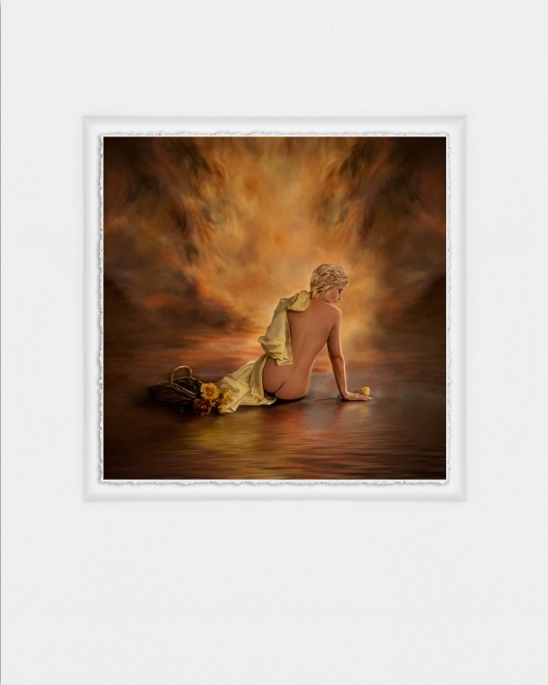
Kelly Willis, owner of Modello Fine Portraits in Deer Park, Texas, made a deal with one her best clients who wanted a boudoir photo session. She gave the client and any friends who also wanted a boudoir session a special rate if they agreed to pose for photos she could use at competition.
Category: Photoshop (3)
Posted on
by
Regan Dickinson
Posted in
Sunset Print Award,
Photoshop,
Print Competition,
Photo Competition,
Corel Painter,
Case Studies & Profiles,
Reverie,
Modello Fine Portraits,
Photo Session,
Kelly Willis,
Southwest PPA District Competition
Leave a comment
Prints that Win: Reverie
Posted on
by
Regan Dickinson
Posted in
Sunset Print Award,
Photoshop,
Print Competition,
Case Studies & Profiles,
Portrait Photography,
Bombshell,
Topaz Software,
Commemorative Air Force Minnesota Wing,
Photography Studio,
Stephanie Oman,
The Imagery Photography Gallery,
Twin Cities Professional Photographers Association,
Rod Oman,
Nik Color Efex Pro
Prints that Win: Bombshell
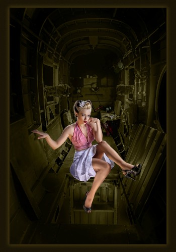
Sometimes the key to award-winning photography is not to shoot with a competition in mind. In the case of this Sunset Print Award winner at the recent Twin Cities Professional Photographers Association competition, this image evolved into an award-winner. Rod Oman, who owns The Imagery Photography Gallery with his wife, Stephanie, was working at the Commemorative Air Force Minnesota Wing as part of a fundraiser for the organization. Oman was joined by other photographers, makeup artists and models as they created scenes focusing on vintage WWII aircraft. “We were shooting the exterior of one of the airplanes, and someone suggested we shoot inside the plane. I shot away with the model, Elizabeth Noir, looked at the images in the camera back and thought it might be cool to work up,” recalls Oman. “It was really a simple shot with natural light, but the post-processing is what makes it different.” Here’s Oman’s original capture before he applied some magic in post-processing. ...
Prints that Win: Peace on Earth
A classic American scene, photographed by veteran photographer Uldis Ilvess and entitled Peace on Earth, is one of our first Sunset Print Award winners for 2014. By virtue of his award at the recent Professional Photographers of Iowa competition for Peace on Earth, Ilvess is also one of the first to be entered into the Sunset Print Award national competition.
Julia Kelleher, owner of Jewel Images in Bend, Ore., says she initially struggled with this composition, entitled He Has Arrived, but decided not to worry so much about the end result and plow ahead with her concept. The result was a 100 score and a LexJet Sunset Award in the Master Artist category at the PPA Western District print competition held in late August. “We get so stifled during the creative process because we’re scared the outcome won’t be what we want it to be. Instead, we should be going back to our childhood way of thinking and just have fun with it. Obviously I care what the final product it is, but I finally said to myself, ‘Let’s try it and see what happens,’ which allowed me to be more creative and produce the end result I was looking for,” says Kelleher. “For the longest time I was scared to enter that category because I didn’t think I was technically sound enough to do it. When the pieces started coming together, however, it was technically sound and it looks...
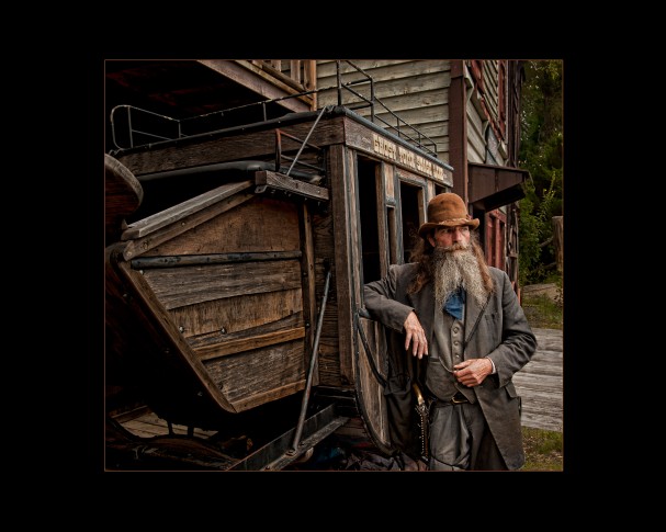
One of the “secrets” of a great portrait photo is bringing out the character of the subject. But what if the subject is a character? All the better, as you can see from this recent winner of the LexJet Sunset Award at the Georgia PPA print competition. Entitled Watching and Waiting, pro photographer Jeff Gulle was commissioned to produce publicity photos for a ghost town-themed amusement park near Maggie Valley, N.C. called Ghost Town in the Sky. With a group of students in tow from North Georgia Technical College in Clarksville, Ga., where Gulle teaches, this particular image was fittingly captured at high noon. The problem with high noon is the lighting, so Gulle and his students waiting patiently for clouds to pass over and lit the Preacher from the right to ensure an image with depth. “I love having the students with me. It elevates my photography since I need to explain everything that goes into the capture: picking locations, lighting, posing, and so forth,” says Gulle. “I...

Elaine and Robert Hughes made a dramatic shift in their photography and art about five years ago. Highly decorated and certified professional photographers who used to specialize in high-end wedding photography, the pair now specializes in creating surreal digital artwork. The pair’s work is an anticipated addition to the various competitions they’ve entered. This past year, Elaine Hughes won a LexJet Sunset Award at the PPA North East District competition for Illustrative Artist. The award-winning print, called Dream World, is a wildly colorful example of Elaine’s original art. “Lately I’ve developed a series connected with water and dreams. It’s chaotic, disconnected and fun, with symbolism you can’t really put your finger on, like in your dreams. I left it open to your own interpretation. The door, for instance, could be the girl’s next journey, your next journey, or you could go in and out of the dream through that door,” Elaine explains. Elaine says developing the art is quite...

Posted on
by
Regan Dickinson
Posted in
LexJet Sunset Award,
Photoshop,
Print Competition,
fine art paper,
Photo Competition,
Corel Painter,
Inkjet Printing,
Case Studies & Profiles,
Cheri MacCallum,
Idaho Falls,
Canon,
Canon iPF8300,
Art by Cheri,
Photography,
Photo Paper,
LexJet,
LexJet 8 Mil ImagePro Gloss,
PPA Western District,
Dennis the Menace
Prints that Win: Dennis the Menace
Cheri MacCallum, owner of Art by Cheri, Idaho Falls, Idaho, is one of those talented few who have had the honor of winning a LexJet Sunset Award two years in a row.
Posted on
by
Regan Dickinson
Posted in
LexJet Sunset Award,
Photoshop,
Sugar and Spice,
Case Studies & Profiles,
Audrey Wancket,
Classical Portrait Photography,
Wancket Studio,
ImagePrint RIP,
PPA Northcentral District,
studio photography,
Photography,
Backgrounds,
Award Winning Print,
Portrait Photography Lighting,
Phase One Medium Format Camera,
LexJet
Prints that Win: Sugar and Spice
For the second year in a row Audrey Wancket’s classical portrait photography won a LexJet Sunset Award for Best Color Printed Image at the recent PPA Northcentral District competition. The winning portrait, called Sugar and Spice, is not an outlier; it is representative of the high-quality work Wancket produces daily for her clients. Situated on 11 acres and built into a barn, Wancket’s studio in Spring Grove, Ill., next to the Wisconsin border, also includes a two-acre wildflower garden perfect for outdoor sessions. The indoor sessions are where Wancket truly shines, bringing the ethos of outdoor lighting into the studio. “The key to my studio photography is the strength and direction of the light. Natural light comes from one side, and I turn the subjects’ faces slightly into that light,” explains Wancket. “And, it depends on who you’re photographing: you put the light on the side where you’re lighting less of their face and other people the broad side of their face, depending on...
Posted on
by
Regan Dickinson
Posted in
Photoshop,
ImagePrint,
Epson,
Case Studies & Profiles,
Wall Murals,
Photo Tex,
LexJet,
Office Decor,
Bill Barley & Associates,
Lexington,
Home Decor,
Custom Wallpaper,
Illustrator,
South Carolina,
Genuine Fractals,
LexJet TOUGHcoat 3R DuPont Tyvek,
David Hedges,
Bill Barley
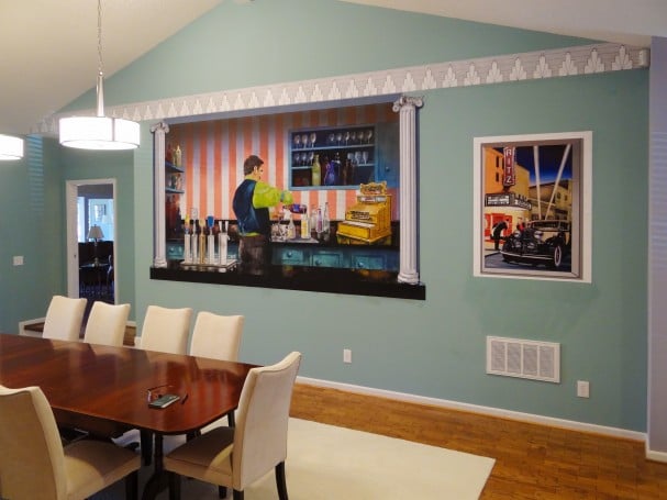
Good, Profitable Business: Custom Inkjet Wall Murals for Home Décor
“It’s good, profitable business,” says Bill Barley, owner of Bill Barley & Associates, Lexington, S.C. That “good, profitable business” to which Barley refers is custom wall murals printed on a variety of materials for home and office décor.

Posted on
by
Regan Dickinson
Posted in
LexJet Sunset Award,
PPA,
PPA Southwest District,
Photoshop,
Rose Garden at Giverny,
Corel Painter,
Backgrounds by Maheu,
Case Studies & Profiles,
Monet,
Oil Painting,
PPA Southeast District,
Competition,
Portrait Photography,
Photography,
LexJet,
Ann Naugher,
Monet's Garden,
David Maheu
Prints that Win: Something Old, Something New
Lightning does strike twice, or at least the LexJet Sunset Award for outstanding photography did. Ann Naugher was honored earlier this year with a LexJet Sunset Award at PPA’s Southeast District competition for her portrait entitled Windswept, and most recently added another to her collection with another portrait entitled Monet’s Garden at the PPA’s Southwest District competition.
Recent Posts
- Glow Up Your Graphics with Holographic Vinyl Magic June 26, 2025
- A First of Its Kind: The Print That Made History in Photography Competition June 24, 2025
- Better Together: Tackle Demanding Installs with This Powerful Duo June 19, 2025
- Fly High with Durable, Eye-Catching UFABRIK Flag Textiles June 17, 2025
- Explore the Possibilities of the Epson® SureColor® T-Series June 3, 2025
Categories
- 3 Mil Gloss UV Premium Low Melt (1)
- 3 Mil Gloss UV Premium Low Melt Laminate (1)
- 3D (1)
- 3D graphics (1)
- A Bridge to Remember (1)
- A Slow Decline (1)
- Aaron Thomason (1)
- AB Photography (1)
- Abstract Art (1)
- Abstract Art Prints (1)
- Accent Lighting (1)
- Acetate (1)
- Acrylic (1)
- Adhesive Backed Fabric (1)
- Adobe Illustrator (1)
- Advertising (2)
- Alon Weiner (1)
- Amanda Crow (1)
- amateur photographer (1)
- Amelia Island (2)
- American Photographic Artists Guild (2)
- Amesbury (1)
- Amy Feick (1)
- Andrea Joliat (1)
- Andrea Phox (1)
- Andrew Jenkins (2)
- Andy Wredberg (1)
- Angela Blankenship (1)
- Angels Bending Near the Earth (1)
- Animal Photography (2)
- Anita Hopper (1)
- Ann Naugher (2)
- anti-bullying (1)
- anti-bullying initiative (1)
- anti-bullying video (1)
- Anti-Graffiti (1)
- Antonelli Institute (1)
- Antonelli Institute of Graphic Design & Photog (1)
- Antonelli Institute Print Competition (1)
- Aperture (1)
- Apparel Printing (1)
- Application (2)
- Application Guide (2)
- Aqueous Inkjet Printers (1)
- Aqueous Printer (1)
- aqueous printing (1)
- Arc Studios Photography (1)
- Architecure (1)
- archival paper (1)
- Arizona Thunder (1)
- Arkansas Professional Photographers Association (1)
- Armonk (1)
- Art (1)
- Art by Cheri (2)
- Art Exhibit (2)
- Art Exhibitions (2)
- Art Foundry International (1)
- Art Printing (1)
- Art Reproduction (2)
- Art Reproductions (1)
- AS Long As One Man Believes (1)
- Ashton Elementary (1)
- Astrophotography (1)
- Atlas Distributing Inc. (1)
- Audrey Wancket (1)
- Autopano Pro (1)
- Autumn Cascades (1)
- Avant Printing (1)
- Avatrex (1)
- AW Artworks (1)
- Award Show Backdrop (1)
- Award Show Graphics (1)
- Award Winning Photography (1)
- Award Winning Print (1)
- Babcock State Park (1)
- Baby Boo Photography (1)
- Baby Photography (1)
- Backgrounds (1)
- Backgrounds by Maheu (1)
- Backlit (1)
- Backlit Prints (1)
- Banner Applications (1)
- Banner Finishing (2)
- Banner Stand Graphics (1)
- Banner Stands (2)
- Banners (2)
- Bar Mitzvah (1)
- Barn-Door (1)
- Basic Mode Settings (1)
- Basketball Court (1)
- Beartooth Photography (1)
- Beer (2)
- Beer Distributor (1)
- Behlmann Digital (1)
- Ben Shirk (1)
- Ben Tanzer (1)
- Best in Show (1)
- Best Print in Show (1)
- Beverage Barn (1)
- Beverage Distribution (1)
- Beverage Distributor (2)
- Beyond the Lens (4)
- Big Sqeegee (1)
- Bill Barley (1)
- Bill Barley & Associates (1)
- billboard (1)
- billy d photography (1)
- billy dzwonkowski (1)
- Billy Wright (1)
- Bird Dog Distributing (1)
- bird illustrations (1)
- Black and White (1)
- Black and White Photography (3)
- Black Friday Deal (1)
- Black Friday Sale (1)
- Blackfoot (1)
- Blowing Out of a Creative Funk (1)
- Blue Moon (1)
- Bob Klein (1)
- Boise (1)
- Bombshell (2)
- Bonnaroo Music & Arts Festival (1)
- Bonnie and Clyde (1)
- Branding (4)
- BREA Photos (1)
- Brent Lee (1)
- Brett Feldman (1)
- Brian Killian (1)
- Brian Rogers (2)
- brick surfaces (1)
- Brookfield (1)
- bryan allen (1)
- Bumblejax (1)
- Burg Photographix (1)
- Burma (1)
- Business (1)
- buy LexJet online (1)
- BWC (2)
- CAD (1)
- California (2)
- California Photographer (1)
- Camera (2)
- Canfield Jenkins House of Photography (1)
- Canon (30)
- Canon 1D X (1)
- Canon 7D (2)
- canon colorado (3)
- Canon Colorado M-Series (1)
- Canon EOS 5D Mark II (1)
- Canon EOS 5D Mark III (1)
- Canon EOS 60Da (1)
- Canon EOS-1Ds Mark III (1)
- Canon imagePROGRAF (3)
- Canon imagePROGRAF PRO-4100 (1)
- Canon iPF 6350 (1)
- Canon iPF Printers (1)
- Canon iPF5100 (1)
- Canon iPF6100 (2)
- Canon iPF6400S (1)
- Canon iPF8000S (2)
- Canon iPF8100 (1)
- Canon iPF8300 (7)
- Canon iPF8300S Inkjet Printer (1)
- Canon iPF9400 (1)
- Canon Printer Rebates (1)
- Canon PRO-4000 (1)
- Canon PRO-series (1)
- Canvas (5)
- canvas art (1)
- Canvas Coating (1)
- Canvas Corner Folds (1)
- Canvas Demonstration Video (1)
- Canvas Gallery Wrap (1)
- Canvas Gallery Wraps (4)
- Canvas Inkjet Printing (1)
- Canvas Paper (1)
- Canvas Photo Paper (1)
- Canvas Print (1)
- Canvas Print Production (1)
- Canvas Printing (6)
- Canvas Prints (2)
- Canvas Sale (1)
- Canvas Stretch Master (1)
- Canvas Stretcher Bars (1)
- Canvas Stretching (1)
- Cape Cod (1)
- Carey Masera (1)
- Carlisle (1)
- Carpet Graphics (1)
- Case Studies & Profiles (149)
- Case Studies & Profiles (1)
- Cash In & Trade Up (1)
- Castle (1)
- Cat Photo (1)
- Catherine Sebastian (1)
- Cathleen Broderick Photography (1)
- Cathy Broderick (1)
- Cave City (1)
- Center on Contemporary Art (1)
- Certified Professional Photographer (3)
- Certified Professional Photographers (1)
- CET Color X-Press (1)
- chalk art (1)
- Change-Seed (1)
- Chaotic Profiling (1)
- Cher Sailer (1)
- Cheri Hammon (1)
- Cheri MacCallum (2)
- Cherished Images (1)
- Chicago (1)
- Chris Anderson (1)
- Chris Orwig (1)
- Chris Shigley (1)
- Chris Smith (1)
- Christie Kline (1)
- Christine Cook (2)
- Christmas (1)
- Christmas Cards (1)
- Christmas ornaments (1)
- ChromaLuxe (1)
- Church of the Land (1)
- Church Photo (1)
- Cindy Strupp (1)
- CJV330-130/-160 (1)
- Clarksville (1)
- Classic Car Photography (1)
- classic portrait (1)
- Classical Portrait Photography (1)
- Clay Blackmore (1)
- Clearcoating Canvas (1)
- ClearStar Coating (1)
- Cleveland (1)
- Cleveland Plain Dealer (1)
- click and win (1)
- CNC Router (1)
- Coatings (1)
- coatings for canvas (1)
- CoCA (1)
- Cody (1)
- Colonial Beverage (2)
- Color Checkers (1)
- Color Efex Pro (1)
- Color Gamut (3)
- Color Management (1)
- Color Management Software (1)
- ColorBurst (1)
- ColorMunki Photo (1)
- Commemorative Air Force Minnesota Wing (1)
- Commercial Decor Printing (2)
- Commercial Photography (3)
- Commonwealth Photography (1)
- compact printers (1)
- Competition (12)
- Competition Lighting (1)
- Competition Photography (2)
- Competition Printing (8)
- Concours D'Elegance (1)
- concrete (1)
- confederate soldier (1)
- Cooler Wrap (2)
- Coors (1)
- Coors Light (1)
- Corel Paint (2)
- Corel Painter (6)
- Corona (1)
- Coroplast (1)
- Corplast (1)
- Corporate Apparel and Printing (1)
- corporate design (1)
- Corporate Graphics (1)
- Cotton Rag (1)
- Covington (1)
- Creative Cards by Linda (1)
- CTPPA (1)
- Curves of Iris (1)
- Custom Decor (1)
- Custom Frame Shop (1)
- Custom Framed Artwork (1)
- Custom Inkjet Printing (1)
- Custom SEG frames (3)
- Custom Wall Art (3)
- custom wall mural (1)
- Custom Wallcoverings (2)
- Custom Wallpaper (2)
- Customer Experience (2)
- Customer Service (1)
- Customizable framing systems (1)
- customized gifts (1)
- customized wall paper (1)
- D&K 6 Mil UV Textured Vinyl PSA (1)
- Dali Lama (1)
- Dallas (4)
- Dalton (1)
- Dan Johnson (1)
- Dan Johnson Photography (1)
- Dana Shaffer (1)
- Dance Floor (1)
- Darrell Moll (1)
- Dave Hall (1)
- David Hedges (1)
- David Hyttsten (1)
- David Jeffery (1)
- David Maheu (1)
- David Raszka (1)
- David's Photography (1)
- Dawn Muncy (1)
- DCG Digital Color Graphics (1)
- DDS (1)
- Debra King (1)
- Deckled Edges (1)
- Decor Printing (5)
- DeCrescente Distributing (1)
- Delivery (1)
- Deltona (1)
- Demonstration (1)
- Dennis Hammon (2)
- Dennis the Menace (1)
- Departing Flight (1)
- Depth of Field (1)
- Design (2)
- Designjet 5500 (1)
- Desktop UV Printer (2)
- Detroit (1)
- Diageo (1)
- Dick Bennett Photography (1)
- Digital (1)
- Digital Art (2)
- Digital Art Creation Magazine (1)
- Digital Art Summit (1)
- Digital Artwork (1)
- Digital Fine Art (1)
- Digital Output (1)
- Digital Output Top 50 Readers' Choice Awards (1)
- Digital Painting (2)
- Digital Painting Techniques (1)
- Digital Photography (3)
- digital printing (5)
- Digital Printmaking (1)
- Digital Sports Photography (1)
- digital wallcovering (1)
- digital wallcoverings (2)
- digital wallpaper (1)
- digitally printed fabric (1)
- digitally printed textiles (2)
- Dimensional Signage (1)
- Dimpled Rock (1)
- Dipsy Daisy (1)
- Discount Canvas (1)
- Display (2)
- Display Graphics (1)
- DIY products (3)
- Dmax (1)
- DockDogs (1)
- Dog Photography (1)
- DPI 2014 (1)
- DPI-SIG of Naples Camera Club (1)
- Dream Copy Photo (1)
- Dream World (3)
- Dry Application (1)
- Dual-Array PrecisionCore® TFP® print heads (1)
- Dublin (1)
- Duncan MacNab (1)
- Duotone Images (1)
- dye-sub fabrics (2)
- Dye-Sub Printer (2)
- Dye-Sub Printing (3)
- dye-sub transfer (1)
- dye-sublimation printer (4)
- Dynamite Prices (1)
- Décor (4)
- Earth Day (1)
- Easy to Install Wraps (1)
- Eckley Miners' Village (1)
- Eco Solvent Printers (1)
- eco-friendly (2)
- eco-friendly window film (1)
- eco-solvent inks (1)
- Eco-Solvent Printer (2)
- Eddie Tapp (2)
- edge points (1)
- Editorial (1)
- Educational Graphics (1)
- Edwin Church (1)
- EFI (6)
- EFI 32r+ (1)
- EFI Customer Experience Center (2)
- EFI Ignite (1)
- efi pro 16H (1)
- EFI Pro 32r+ Printer (1)
- EFI VUTEk FabriVU 340i+ (2)
- efi wide format printers (3)
- Elaine Hughes (3)
- Electronic Imaging (1)
- Elements Portfolio (2)
- Elizabeth Ashford (1)
- Elizabeth Ellenwood (1)
- Elizabeth Van den Boeck (1)
- Elizabeth's Art Gallery (1)
- Ellwood T. Risk (1)
- Encaustic Painting (1)
- Encore Editions (1)
- End of the Line (1)
- Environmentally Friendly Printing (1)
- ePrinter (1)
- Epson (36)
- Epson 11880 (1)
- Epson 3880 (1)
- Epson Dye-Sub (3)
- Epson dye-sublimation printer (3)
- Epson eco-solvent (1)
- Epson education (1)
- Epson F170 (3)
- epson f570 (4)
- Epson F9470 (1)
- Epson P-Series printers (2)
- Epson Premium Luster Photo Paper (1)
- Epson printer (5)
- Epson printer rebates (1)
- Epson printer review (1)
- epson r-series (2)
- Epson S-Series (1)
- Epson S40600 (2)
- Epson S60600 (2)
- Epson S80600 (2)
- Epson solvent printer (3)
- Epson Stylus Pro 11880 (2)
- Epson Stylus Pro 3880 (3)
- Epson Stylus Pro 7800 (2)
- Epson Stylus Pro 7900 (1)
- Epson Stylus Pro 9800 (1)
- Epson Stylus Pro 9900 (4)
- Epson Stylus Pro GS6000 (1)
- Epson Stylus Pro Inkjet Printer (1)
- Epson SureColor (3)
- Epson SureColor P-Series (1)
- Epson SureColor Printer (2)
- Epson SureColor Printers (2)
- Epson SureColor R5070L (2)
- Epson SureColor S-Series (3)
- Epson SureColor S30675 (1)
- Epson SureColor S50675 (1)
- Epson SureColor S60600 (1)
- Epson SureColor S70670 (1)
- Epson SureColor S70675 (1)
- Epson SureColor S80600 (2)
- Epson SureColor S9170 (1)
- Epson SureColor T-Series Inkjet Printers (1)
- Epson SureColor V1070 (2)
- Epson T Series Printer (1)
- Epson T-Series Printers (1)
- Epson Technical Printers (1)
- Epson UltraChrome (1)
- Epson UltraChrome Ink (1)
- Epson webinar (1)
- Erdenheim (1)
- Eric Hopper (1)
- esatin (1)
- Evening Mist (1)
- Event (1)
- Event Graphics (1)
- Exhibition (1)
- Expand Banner Stand (1)
- Expand Banner Stands (1)
- Exposure (1)
- External window graphics (1)
- Fabric (2)
- fabric banner (1)
- Fabric Banners (2)
- Fabric Printing (3)
- Fabric Prints (1)
- Face Mount Acrylic (1)
- FaceMount Perforated Window Graphics (1)
- Family Portrait (1)
- Family Portraits (1)
- February (1)
- February printer rebates (1)
- Feeling out of Place (1)
- Fibre Based (1)
- Fibre Based Inkjet Paper (1)
- Field Museum (1)
- Film (1)
- Film Noir (1)
- Filter (1)
- Find a Printer on a Network (1)
- Fine Art (8)
- Fine Art of Photography (2)
- fine art paper (6)
- Fine Art Papers (1)
- fine art photographs (1)
- Fine Art Photography (3)
- Fine Art Portrait Photography (4)
- Fine Art Print (1)
- Fine Art Printing (3)
- Fine Art Printmaking (1)
- Fine Art Prints (3)
- Fine Art Reproduction (6)
- fine art reproductions (2)
- Finishing (3)
- Firehole River (1)
- Firmware (1)
- Fischer Photography (1)
- Flags (2)
- Flamingo Hotel (1)
- Flatbed Printer (1)
- Flatbed Printing (2)
- Fleet Graphics (1)
- Flexible Media (1)
- FlexiSIGN (1)
- Floor Graphics (5)
- Florida (2)
- Florida Camera Clu (1)
- Florida Camera Club Council (1)
- Florida PPA (1)
- Florida Professional Photographers (3)
- Flow Photography (1)
- flower photography (1)
- FLXfinish+ (1)
- Fonthill Castle (1)
- Football (1)
- Fort (1)
- Fort Plain (1)
- fpp (1)
- Framed Art (1)
- Frames (1)
- Fredrix (1)
- Fredrix 901SJ Select Matte Canvas (1)
- Fredrix canvas (1)
- Fredrix Metallic Gold (1)
- Fredrix Metallic Pearl (1)
- Free Download (1)
- Free Webinars (2)
- Fresnel (1)
- Fuji X-T1 (1)
- Galaxies (1)
- Gallery (1)
- GAPP Engineering (1)
- Garith Rockliffe (1)
- Gary Kellner (1)
- Gary Meek (2)
- Gary's Studio of Photography (1)
- Gator Board (2)
- General Formulatins (1)
- General Formulations (4)
- General Formulations 831 AutoMark™ Cast Gloss Clea (1)
- General Formulations RoughMark™ 285 (1)
- Genuine Fractals (1)
- Georgia (2)
- Georgia PPA (1)
- Georgia Professional Photographers Association (2)
- German Etching 310 (1)
- Gettysburg (1)
- GF 226 WallMark Vinyl (1)
- GF AutoMark Cast With Drift (1)
- GF Automark High Gloss Clear UV Cast Laminate (1)
- GF Cast Vinyl (2)
- GF Rainbow Holographic Film (1)
- GF RoughMark 285 (1)
- GF RoughMark 885AE (1)
- GF Sparkle Holographic Film (1)
- Ghost Town in the Sky (2)
- gift giving (1)
- GLI (1)
- Gloss (1)
- Gloss Print (2)
- go-to products (1)
- GOframe (1)
- Golden Arches (1)
- Golf Course Landscape Photography (1)
- Golf Course Photography (1)
- Golf Course Prints (1)
- Gordon (1)
- Gordon Kreplin (1)
- Government Graphics (1)
- Grand Rapids (1)
- Grand Teton National Park (1)
- Granite (1)
- Graphic Art (1)
- Graphics (2)
- Graphics Lamination (1)
- graphtec (1)
- Greater Louisville Inc. (1)
- Greenbush (1)
- Greeting Cards (1)
- Greg Doucet (1)
- Gregory Georges (1)
- Grellner Sales & Service (1)
- Gretchen Carter (1)
- Grist Mill (1)
- Guide (1)
- Guinness (1)
- Hahnemuhle (5)
- hahnemuhle canvas (1)
- Hahnemuhle FineArt Baryta (2)
- Hahnemuhle paper (2)
- Hahnemuhle Photo Rag (1)
- Hahnemühle fine art paper (2)
- hand roll coating (1)
- handbag design (1)
- hard surfaces (1)
- Hare Apparent (1)
- Harmony and Nick Portrait Artists (1)
- Harmony Jones (1)
- Harp (1)
- Harry Potter (1)
- Harvard Press (1)
- Hasselblad (1)
- Hayes and Fisk (1)
- HDR (1)
- HDR Photography (1)
- Head Cleaning (1)
- heat press (1)
- Heather Storm (1)
- Heineken (1)
- High Quality Inkjet Photo Paper (1)
- High School Seniors (1)
- High Volume Wide Format Printing (2)
- Historical Photographs (1)
- hobbyist (1)
- holiday photo papers (1)
- Holidays (1)
- Home Decor (2)
- Hong Kong Umbrella Revolution (1)
- Hopkins Fine Portraits (1)
- hospitality decor (1)
- Hot One Awards (1)
- How To (5)
- How to Apply Window Graphics (1)
- How To Coat Canvas (1)
- How To Troubleshoot Lamination (1)
- How To Videos (1)
- how-to tips (3)
- Howard Studios (1)
- HP (11)
- HP Designjet L26500 Latex Inkjet Printer (1)
- HP Designjet Z5400 PostScript ePrinter (1)
- HP INstant Printing PRO (1)
- HP L25500 Latex Printer (1)
- HP Latex 210 (1)
- HP Latex 260 (1)
- HP Latex 280 (1)
- HP Latex 300 Series (1)
- HP Latex 3000 (1)
- HP Latex 360 (1)
- HP Latex 630W (1)
- HP Latex 730W (1)
- HP Latex 800 Series (2)
- HP Latex 830 (1)
- HP Latex Inks (3)
- HP Latex Print & Cut (1)
- HP Latex Printer (4)
- HP Latex Printer Applications (3)
- HP Latex Printers (5)
- HP Latex printing (7)
- HP Latex Printing Technologies (2)
- HP Latex R530 (1)
- HP Light Fabric (1)
- HP Multi-Dimensional Smart Drop Placement (1)
- HP Photo Inks (1)
- HP Photo-realistic Poster Paper (1)
- HP Premium Clear Window Film (1)
- HP Premium Poster Paper (1)
- HP Prime Gloss Air GR (1)
- HP Printer Rebates (1)
- HP PVC-free Durable Smooth Wall Paper (1)
- HP PVC-free Wall Paper (1)
- HP Technology (1)
- HP Upgrade to Latex (1)
- hp white ink (2)
- HPLV (1)
- hybrid printer (2)
- Hydrogen-Alpha Lines (1)
- I.T. Strategies (1)
- i1Display Pro (1)
- i1Profiler (1)
- Icebound Anomaly (1)
- Idaho (2)
- Idaho Falls (2)
- illustrative (1)
- Illustrator (1)
- image awards (1)
- image competition (1)
- ImagePrint (2)
- ImagePrint RIP (3)
- imagePROGRAF (1)
- imagePROGRAF Firmware Update Tool V24.00 (1)
- images printed on leather (1)
- Imaging USA (1)
- Impact Photography (1)
- In Flight with Twigs (1)
- In House Printing (2)
- Inc.credible Awards (1)
- Indoor Display Graphics (1)
- Indoor Graphics (1)
- Inffeed Waves (1)
- Ink (2)
- Ink Drying on Print (1)
- Inkjet (2)
- Inkjet Canvas (4)
- Inkjet Canvas Collage (1)
- Inkjet Cartridge Recycling (1)
- Inkjet Fabric (2)
- Inkjet Graphics (1)
- Inkjet Media (3)
- Inkjet Photo Paper (1)
- Inkjet Printer (9)
- Inkjet Printers (3)
- Inkjet Printing (58)
- Inkjet Printing Tips (1)
- Inkjet Wall Murals (1)
- Inkjet Wallpaper (1)
- Innovation (1)
- Instagram (1)
- Installation Guide (1)
- Instant Rebate (1)
- Instructional Videos (1)
- Interior Decor (1)
- Interior Design (3)
- Intermountain Professional Photographers Associati (1)
- international print competition (2)
- Internet (1)
- IP Address (1)
- iPad Promotion (1)
- iPF (1)
- iPF Printers (1)
- iPF5100 (1)
- iPF6100 (1)
- iPF6300 (1)
- iPF6350 (1)
- iPF8000S (1)
- iPF8300 (1)
- iPF9000S (1)
- iPF9100 (1)
- ISO (1)
- It Was the Best of Times (1)
- Ivey Photography (1)
- Jackson Pollock (1)
- Jaki Good Miller (1)
- Jaki Miller (1)
- James Audubon (1)
- James Steinmetz (1)
- James Trapp (1)
- Jamie Birch (1)
- Jamie Steeno (1)
- Janine Peters Killian (1)
- Jeff Behlmann (1)
- Jeff Bowman (1)
- Jeff Dachowski (1)
- Jeff Gulle (4)
- jennifer Palumbo (1)
- Jerry Ghionis (1)
- Jerry Lodriguss (1)
- Jessup Floor Graphics (2)
- JetFlex FL Matte (1)
- Jewel Images (1)
- Jim Trapp (1)
- John Gladman (1)
- Jon Scott (1)
- Jonathan Penney (3)
- Jonathan Penney Inc. (1)
- JPEG (1)
- JS Graphics (1)
- judging (1)
- Julia Kelleher (1)
- June Greenspan (1)
- Kara Work (1)
- Karen Peters (1)
- Kari Douma (3)
- karidouma (1)
- karidoumappa (1)
- Kathryn Meek (1)
- Kathy Meek (1)
- Keder tape (2)
- Kelly Price (1)
- Kelly Schulze (3)
- Kelly Willis (1)
- Kelly Zimmerman (1)
- Ken Stoecklin (1)
- Kenny King (1)
- Kentucky (2)
- Kentucky Professional Photographers Association (1)
- Kevin Kubota (1)
- Kidnapped by Tuscan Fog (1)
- kim smith (1)
- kimberly j smith (1)
- kimberly smith (1)
- Kodak (1)
- Kodak Gallery Elite Award (1)
- KODAK PROFESSIONAL Inkjet Photo Paper Luster Finis (1)
- Kristi Elias (3)
- Kristi Sutton Elias Photography (2)
- Kroger (1)
- Kroger History (1)
- Kung POW Chicken (2)
- La Petite Mademoiselle (1)
- Lab (1)
- Laminate (1)
- Laminating (2)
- Lamination (1)
- Laminator (1)
- lamp shades (1)
- Landscape (1)
- Landscape Photography (4)
- Large Format (1)
- Large Format Printing (1)
- Larry Peters (1)
- Latex (3)
- Latex Inkjet Printer (1)
- Latex Inks (1)
- latex media (1)
- Latex Printer (1)
- Latex Printers (3)
- Latex Printing (1)
- latex printing technology (3)
- Latex Squid (1)
- Latex window film (1)
- Laura Wagoner (1)
- Lauren Driscoll (1)
- Lebanon (1)
- LED (1)
- LED Lighting (1)
- LED production printer (1)
- Lens (1)
- Lexington (1)
- LexJet (94)
- LexJet 11 Mil Blockout Water-Resistant Polypropyle (1)
- LexJet 3 Mil Matte UV Standard Low Melt (1)
- LexJet 5 Mil Gloss Display Film (1)
- LexJet 5.5 Mil Matte Opaque Display Film (1)
- LexJet 8 Mil ImagePro Gloss (1)
- LexJet 8 Mil ImagePro Satin (1)
- LexJet 8 Mil Production Satin Photo Paper (1)
- LexJet Aqueous Perforated Vinyl (2)
- LexJet Blizzard Outdoor Stand (1)
- LexJet Blog (2)
- LexJet booth (1)
- LexJet Clear PreLume HD (1)
- LexJet Crystal Low-Tack (1)
- LexJet Customer Specialist (1)
- LexJet Customer Stories (1)
- LexJet Edge (2)
- LexJet FaceMount Permanent Adhesive (1)
- LexJet FaceMount-X Removable Adhesive (1)
- LexJet Floor Velvet Laminate (5 Mil) (1)
- LexJet GraphicMount White Adhesive (1)
- LexJet Heavy Duty Banner Tape (2)
- LexJet Instant Dry Canvas (1)
- LexJet Instant Dry Clear Polyester (2)
- LexJet Poly Select (1)
- LexJet Poly Select Blockout Fabric (2)
- LexJet Poly Select Fabric (1)
- LexJet Poly Select Heavy (1)
- LexJet Poly Select Medium (1)
- LexJet Premium Archival Matte (1)
- LexJet Premium Archival Matte Paper (1)
- LexJet Print-N-Stick (1)
- LexJet Print-N-Stick Fabric (6)
- LexJet printer sale (1)
- LexJet sale (1)
- LexJet Satin Light Block Polyester (1)
- LexJet Simple Adhesive Vinyl SUV (1)
- LexJet Simple CarpetAd (1)
- LexJet Simple Flo Wrap Gloss UV Laminate (1)
- LexJet Simple Flo Wrap Vinyl (2)
- LexJet Solvent Print-N-Stick Fabric (1)
- LexJet Sunset (3)
- LexJet Sunset Award (29)
- LexJet Sunset Fibre Elite (2)
- lexjet sunset fibre rag (1)
- LexJet Sunset Fine Art Papers (1)
- LexJet Sunset Hot Press Rag (1)
- LexJet Sunset Hot Press Rag 310g (1)
- LexJet Sunset Photo eSatin Paper (2)
- LexJet Sunset Photo Metallic Paper (4)
- lexjet sunset print award (2)
- LexJet Sunset Print Awards (1)
- LexJet Sunset Production Matte Canvas (1)
- LexJet Sunset Reserve Bright Matte Canvas (2)
- LexJet Sunset Stretcher Bars (1)
- LexJet Sunset Velvet Rag (1)
- LexJet Sunset Velvet Rag SUV (1)
- LexJet TOUGHcoat (1)
- LexJet TOUGHcoat 3R DuPont Tyvek (1)
- LexJet TOUGHcoat Water-Resistant Polypropylene (1)
- LexJet TOUGHcoat Water-Resistant Self Adhesive Pol (1)
- LexJet Video (2)
- lexjet webinars (1)
- LexJet YouTube Vidoes (1)
- Light (1)
- Lighting (2)
- Lightroom (2)
- Linda Dahlberg (1)
- Linda Guy (1)
- Lintec (3)
- Lintec Window Film (3)
- liquid coating (1)
- Liquid lamination with roller (1)
- Lisa Cuchara (1)
- Little Miss Muffet (4)
- Little Red Riding Hood (1)
- Live Event Graphics (1)
- Living History Farms (1)
- Loius Brevetti (1)
- London Tavern (1)
- Long Beach (1)
- Low Solvent (1)
- Low Solvent Printer (1)
- Lowell's Boat Shop (1)
- Lowell's Boat Shop Workroom Door (1)
- Lumix Digital Single Lens Mirrorless Camera (1)
- Luster (1)
- Luster Laminate (1)
- Lytro (1)
- Maasai Mara Project (1)
- Mac (1)
- Macone (1)
- Macrophotography (1)
- mactac (1)
- Madison (1)
- Maggie Valley (1)
- Mail In Rebate (1)
- Makeshift (1)
- Maldives Canvas (1)
- Manchester (1)
- Map Printing (1)
- Marabu ClearShield (1)
- Marabu ClearShield Anti-Graffiti (1)
- Marabu Coating (3)
- Marabu coatings (1)
- Marabu Products (5)
- Marco Ferrero (1)
- Mark Bryant (1)
- Marketing (4)
- Marketing & Sales (15)
- Marketing Photography (1)
- Mary Fisk-Taylor (1)
- Massachusetts (1)
- Master Artist (4)
- Master of Photography (1)
- master photographer (3)
- Matt (1)
- Matt Baxter (1)
- Matte (1)
- McKay Photography Academy (1)
- MediaScreen (1)
- Melissa Jean Photography (2)
- Melissa Jeffcoat (2)
- Melissa Thompson (1)
- Mercer Museum (1)
- Merrimack River (1)
- Metal (1)
- metallic paper (1)
- Metallic photo paper (1)
- metallic silver ink (1)
- michael novo (1)
- Michael Timmons (7)
- Michael Zerivitz (1)
- Michigan (4)
- michigan ppa (1)
- Mike's Hard Lemonade (1)
- MillerCoors (1)
- Mimaki (8)
- Mimaki 330 (1)
- Mimaki Entry-Level Printers (1)
- Mimaki JFX600-2513 (1)
- Mimaki JV100-160 Printer (1)
- Mimaki JV330 (1)
- Mimaki LA-160W (1)
- Mimaki Laminators (1)
- Mimaki printers (4)
- Mimaki UCJV300 Print and Cut Printers (2)
- Mimaki UCJV300-160 (3)
- Mimaki UCJV330 (1)
- Mimaki UJV100-160 (1)
- Mimaki UJV55-320 (1)
- Mimaki UV (2)
- Minnesota (1)
- Modello Fine Portraits (1)
- Monet (1)
- Monet's Garden (1)
- Monitor Calibration (1)
- Montana (1)
- Montana Professional Photographers (1)
- Monty Pyle (1)
- Morning on Mormon Row (1)
- Morning Rounds (1)
- Mostts Military Museum (1)
- Mountain Dog Photography (3)
- Multi Media (1)
- Museum (1)
- Museum Display (1)
- Museum Graphics (1)
- Music Festival (1)
- Myanmar (1)
- name-calling (1)
- Naples (1)
- National Geographic Museum (1)
- National Sunset Print Awards (1)
- National Sunset Print Competition (1)
- Natural Paper (1)
- Nature Photography (1)
- Naval Special Warfare (1)
- Navy SEAL (1)
- Navy SEAL Foundation (1)
- Neal Rantoul (1)
- Nebulae (1)
- networking (1)
- Nevada (1)
- Nevessa Studios (1)
- New England Photography (1)
- New Hampshire Institute of Art (1)
- New Hampshire PPA (1)
- new hp printers (1)
- new printers (3)
- New Technology (1)
- New York (2)
- New York Cultural Society (1)
- Newborn Photography (1)
- Newbrough Photo (1)
- News & Trends (13)
- News and Trends (1)
- Nice Catch (2)
- Niche Markets (1)
- Nick Jones (1)
- Night Photography (1)
- Nik (2)
- Nik Color Efex Pro (1)
- Nik Color Efex Pro 4 (1)
- Nik Filters (1)
- Nik Silver Efex Pro (2)
- Nik Silver Efex Pro 2 (2)
- Nik Software (5)
- Nikon (1)
- Nikon D800 (1)
- no-sew SEG frame (2)
- Noise (1)
- Nolan Dowdy (1)
- Norfolk (1)
- North Carolina (2)
- North Carolina Professional Photographers Associat (1)
- North Georgia Technical College (2)
- Northern Light PPA Print Competition (1)
- Northwest Arkansas Sign Shop (1)
- Now and Then (1)
- Nozzle Check (1)
- NY (1)
- Oberon Printing (1)
- October 4 (1)
- Office Decor (1)
- Ohio (1)
- Oil Painting (2)
- OKI (1)
- OKI Data Americas (1)
- Oklahoma (2)
- old west photography (1)
- Online Magazine (1)
- onOne Software (1)
- Onyx (1)
- Onyx Media Manager (1)
- ONYX Thrive (1)
- Open House (1)
- Optically Clear Film (1)
- Oriental Inspiration (1)
- Orlando (1)
- Oustanding Print & Presentation (1)
- outdoor graphics (1)
- Owensboro (1)
- Painting (1)
- pam (1)
- Panasonic Digital Camera (1)
- PanoRama Walk & Wall (1)
- Panoramic Photography (1)
- Paper (1)
- PC (1)
- PDF (1)
- Peace on Earth (1)
- Pennsylvania (2)
- Pennsylvania PPA (1)
- Perforation (1)
- Permanent Window Film (1)
- Pet Photography (2)
- pete rezac (1)
- Pete Wright (1)
- Peter Burg (1)
- Peters Photography (1)
- Phase One Medium Format Camera (1)
- Photo Booth (1)
- Photo Competition (21)
- photo competitions (1)
- Photo Composite (1)
- Photo Composition (1)
- Photo Contest (3)
- Photo Editing (5)
- Photo Exhibitions (1)
- Photo Exposure (1)
- Photo Expressions by Terry Blain (1)
- Photo Gallery (1)
- Photo Lighting (1)
- Photo NorthEast Competition (1)
- Photo Paper (7)
- Photo Print (2)
- Photo Printing (13)
- Photo Pro Network (1)
- Photo Processing (1)
- Photo Session (1)
- Photo Shoot (1)
- Photo Tex (6)
- Photo Tex Repositionable Fabric (1)
- Photobooth (1)
- Photographer (4)
- Photographers (1)
- Photographic Art (1)
- Photographic Printing (2)
- Photography (42)
- Photography Business (2)
- Photography Compeition (1)
- Photography Competition (32)
- photography competition judging (1)
- photography competitions (1)
- Photography Exhibition (1)
- photography judging (2)
- Photography Lighting (2)
- Photography Studio (2)
- Photography Training (1)
- Photography Workshops (1)
- Photomatix (1)
- PhotoNorthEast (1)
- PhotoPro (1)
- PhotoPro Expo (1)
- PhotoPro Network (1)
- Photos (1)
- PhotoShelter (1)
- Photoshop (34)
- Photoshop tips (1)
- Pinup Photography (1)
- Pistachio Alley Photography (1)
- Playing Card (1)
- Plymouth (1)
- Plymouth Center for the Arts (2)
- Plymouth Center for the Arts Fine Art of Photograp (1)
- Point of Purchase (3)
- Point of Sale Printing (1)
- Point-of-Sale (5)
- Poly Select Heavy (1)
- Poly Select Heavy SUV (1)
- Poly Select Light SUV (1)
- Polyester (1)
- POP signage (1)
- Port Huron (1)
- Portable Trade Show Display (1)
- Portrait (1)
- Portrait Photographer (2)
- Portrait Photography (17)
- Portrait Photography Lighting (1)
- Portrait Prints (1)
- Portrait Studio (1)
- Portraits (2)
- Post Up Stand (1)
- Poster (1)
- Poster Print (1)
- Poster Printing (3)
- Posters (2)
- PostNet (1)
- PostScript (1)
- PP of California (1)
- PPA (13)
- PPA Competitions (2)
- PPA North Central District (1)
- PPA North East District (1)
- PPA Northcentral District (2)
- PPA Northeast (1)
- PPA Northeast District (2)
- PPA Northeast District Competition (1)
- PPA Northeast Region (1)
- ppa northwest (1)
- PPA of Georgia (1)
- PPA of Pennyslvania (1)
- PPA Southeast District (3)
- PPA Southeast District Competition (1)
- PPA Southwest District (4)
- PPA Wester District Competition (1)
- PPA Western District (2)
- PPA Western Division (1)
- PPAM (1)
- Primers (1)
- Print (1)
- Print Competition (59)
- Print Competitions (5)
- Print Curl (1)
- print finishing (2)
- Print Laminate (1)
- Print Lamination (1)
- Print Shop (1)
- Print Shops (1)
- Print Transfer (1)
- Print Vinyl (1)
- Print Width Adjustment (1)
- Print-and-Cut Printers (1)
- print-n-stick (1)
- Print-N-Stick Video (1)
- Printable Adhesive Fabric (1)
- printable fabrics (1)
- Printable Sustainable Media (1)
- printable textiles (3)
- printed holiday gifts (1)
- Printed Interior Decor (1)
- printed leather (1)
- Printed Photography (1)
- printer discounts (1)
- Printer Drivers (1)
- Printer Education (1)
- Printer Firmware (1)
- Printer Rebates (1)
- printer sales (1)
- Printer Software (1)
- printers (1)
- printers on sale (1)
- PrintFactory (1)
- Printing Canvas (1)
- printing fabric (1)
- Printing solution (2)
- Printing Tips (1)
- Printing United (2)
- printmyphotooncanvas.com (1)
- Prints that Win (11)
- privacy windows (1)
- product photography (1)
- production printer (1)
- Production Printing (2)
- production-level printer (1)
- Professional (1)
- Professional Photographer (8)
- Professional Photographer magazine (1)
- Professional Photographers Association of America (6)
- Professional Photographers Association of Massachu (1)
- Professional Photographers Magazine (1)
- Professional Photographers of America (3)
- Professional Photographers of California (3)
- Professional Photographers of Idaho (2)
- Professional Photographers of Iowa (3)
- Professional Photographers of Michigan (2)
- Professional Photographers of North Carolina (1)
- Professional Photographers of Ohio (2)
- Professional Photographers of Oklahoma (1)
- Professional Photographers of Pennsylvania (1)
- professional photography (6)
- Proffesional Photogaphers Association of Pennsylva (1)
- Promotional Printing (1)
- Promotional Products (4)
- Promotions (1)
- Promotions & Rebates (4)
- Psychology in Photography (1)
- Purple Heart (1)
- PVC alternative (1)
- PW Photography (1)
- Pyramid (1)
- R5070 (1)
- R5070L (1)
- Rail Art (1)
- Rail Clubs (1)
- Railroad Photography (1)
- Ram Tamir (1)
- Randy McNeilly (2)
- Raven Image (1)
- Reading and Pennsylvania Railroads (1)
- Really Right Stuff (1)
- recycling (1)
- Red Emission Nebula (1)
- Red River Photo Services (1)
- reenactor (1)
- ReFind Originals (1)
- Removable fabric (1)
- Removable Graphics (1)
- Removing Graphics (1)
- Renaissance Art (1)
- Renaissance Imaging (1)
- Rendezvous (1)
- Replacing Printheads (1)
- Repositionable Fabric (2)
- Repositionable Graphics (1)
- residential decor (2)
- resin (1)
- Resin Printed Fabric (1)
- resin printers (2)
- Retail Graphics (1)
- retail windows (1)
- Retractable Display (1)
- Retreat (1)
- Revelation Photography (1)
- Reverie (1)
- Richmond (1)
- Richmond Camera (1)
- Rio (1)
- Riot Creative Imaging (1)
- RIP (3)
- RIP Queue (1)
- RIP Software (3)
- Rivets (1)
- Ro2 Art (1)
- Rob Payne (1)
- Robert A. Howard (2)
- Robert Charles Photography (1)
- Robert Hughes (3)
- Robyn Rickansrud (1)
- Rod Oman (1)
- Rodeo Banners (1)
- Rolling (1)
- Rolls (1)
- Room Dividers (1)
- Rope Lighting (1)
- Rose Garden at Giverny (1)
- Russell James (1)
- S & N Photography (1)
- S-One Studios (1)
- Sacramento (1)
- Safe Harbor (1)
- Sales (1)
- Saloni Desai (1)
- Samson (1)
- Samuel Adams (1)
- Satin (1)
- school project (1)
- scrapbook (1)
- Screen Printing (1)
- Scrim Viny Banner (1)
- Seattle (1)
- Seattle art scene (1)
- See Through (1)
- self-adhesive fabric (1)
- Self-Portrait (1)
- Senior Portraits (2)
- Serenity (1)
- Setup (1)
- Shayna Lohmann (1)
- She's a Dream (1)
- Sheets (1)
- Sherie Dowsett (1)
- Shiloh Christian (1)
- Shipping (1)
- Shirk Photography (1)
- Short-term Signage (1)
- show special (1)
- Sign (1)
- Sign Lighting (1)
- Sign Printing (1)
- Signage (4)
- Signal (1)
- SignComp (1)
- SignDirector (1)
- Signs (1)
- Silver Efex Pro 2.0 (1)
- Silvering (1)
- Simple Flo Wrap Gloss UV Laminate (1)
- Sintra (1)
- Skylake (1)
- Smirnoff Ice (1)
- Smithwick's (1)
- Snoot (1)
- Snowy Morning (1)
- Social Media (1)
- Soft Signage (5)
- software (1)
- Soicher Marin (1)
- Solvent (3)
- Solvent Inkjet Printer (1)
- Solvent Printer (3)
- Solvent Printing (2)
- Sonshine Portrait Design (1)
- Soul Salvation (1)
- South Carolina (1)
- Southwest PPA (3)
- Southwest PPA District Competition (1)
- space-saving printers (1)
- Special Event Banners (1)
- Special Event Graphics (2)
- Specialty Printing (3)
- specialty prints (1)
- Spectra Imaging (2)
- spiderwort (1)
- sporting event signage (1)
- Spot-gloss (1)
- Spray Gun (1)
- Squid (1)
- Stan Jones (1)
- Stephanie Oman (1)
- Stephen Kerner (2)
- Stephen Poltorzycki (1)
- Steve Cohen (1)
- Steve Holden (1)
- Steven Kemp (1)
- steven yahr (2)
- still life photography (1)
- Stone River Giclee (2)
- Studio Canvas Master (1)
- studio photography (6)
- Sublimation (3)
- Sublimation crafts (3)
- Sublimation Printer (1)
- sublimation products (3)
- Sugar and Spice (1)
- Sunset (35)
- Sunset Award (7)
- Sunset Bright Velvet Rage 315g (2)
- Sunset by Fredriix Satin Canvas SUV (1)
- Sunset by Fredrix Gloss Canvas SUV (1)
- Sunset by Fredrix Matte Canvas (1)
- Sunset Canvas (1)
- Sunset Coatings (1)
- Sunset Etching Greeting Cards (1)
- Sunset Etching SD Paper 210g (1)
- Sunset Fibre Elite (2)
- Sunset Fibre Elite 285g (1)
- Sunset Fibre Matte (1)
- Sunset Fibre Papers (1)
- Sunset Fibre Rag 335g (1)
- Sunset Fine Art (2)
- Sunset Fine Photo (1)
- Sunset Gloss Coating (2)
- Sunset Hot Press Smooth Bright White (1)
- Sunset Photo Canvas Paper 230g (1)
- Sunset Photo eSatin (2)
- Sunset Photo eSatin Paper (8)
- Sunset Photo eSatin Paper 300g (1)
- Sunset Photo Gloss Paper (2)
- Sunset Photo Gloss SUV 275g (1)
- Sunset Photo Metallic Paper (8)
- Sunset Photo Paper (1)
- Sunset Photo Papers (2)
- Sunset Photo Satin SUV 275g (1)
- Sunset Print Award (61)
- sunset print award winner (1)
- Sunset Print Awards (7)
- Sunset Production eSatin 250g paper (1)
- Sunset Production Matte Canvas (1)
- Sunset Reserve Bright Matte Canvas (1)
- Sunset Satin Coating (2)
- Sunset Select Canvas (3)
- Sunset Select Gloss Canvas (1)
- sunset select matte (1)
- Sunset Select Matte Canvas (5)
- Sunset Stretcher Bars (1)
- Sunset SUV Fine Art Paper (1)
- Sunset Textured Fine Art Paper 310g (1)
- Sunset Textured SD Paper (1)
- Sunset Velvet Rag (1)
- SureColor (1)
- Surrealism (1)
- Survey (1)
- Sustainability (4)
- Sustainable paper (1)
- sustainable solutions (1)
- Suzanne Fischer (1)
- T Shirt Printing (1)
- Tabletop Wraps (1)
- Tachihara Field Camera (1)
- Tapestries (1)
- TCU (1)
- TechCrunch (1)
- technical (1)
- Technology (1)
- Technology & Products (32)
- Tecumseh (2)
- Teeny Tucker (1)
- Telescope (1)
- Templates (1)
- Temptress (1)
- Tennessee (1)
- Tennyson Lacasio (1)
- Terra Cotta Warriors (1)
- Terry Blain (2)
- Texas (1)
- Texas PPA Print Competition (2)
- Textures (1)
- Thangkas (1)
- The Bike BUilder (1)
- The Chosen One (1)
- The Classic Image (1)
- The Colonel in Twilight (1)
- The Evil That Men Do (1)
- The Family Album (1)
- The Fine Art of Photography (1)
- The Five (1)
- The Fluffle (1)
- The Imagery Photography Gallery (1)
- The Man in the Mirror (1)
- The Mechanic (1)
- The Portrait Gallery (7)
- TIFF (1)
- Tim Kelly (1)
- TIm Shaffer (1)
- Tina Timmons (4)
- Tips (1)
- Tips & Tricks (31)
- Todd Grubbs (1)
- Todd Hicken (1)
- Tom Cuchara (1)
- tom mcdonald (1)
- Tom Tetreault (1)
- Tony Corbell (1)
- Top New Graphics Products (1)
- Top Products (1)
- Topaz Labs (1)
- Topaz Photoshop Plug In (1)
- Topaz Software (1)
- TOUGHcoat banner materials (1)
- TOUGHcoat Water-Resistant Self Adhesive Polypropyl (1)
- Tracy Raven Jacobs (1)
- Tracye Gibson (4)
- Trade Show (2)
- Trade Show Booth (1)
- trade show materials (1)
- Trade-Show Graphics (4)
- Trains (1)
- Triad Creative Group (1)
- Triangle Photographers Association (1)
- Triangles (1)
- Trimming (1)
- Tripod (1)
- Troubleshooting (3)
- Tulsa (1)
- Tunneling (1)
- Tuscany (1)
- Twilight Zone (1)
- Twin Cities Professional Photographers Association (1)
- Ty Thompson (1)
- UCJV300 Series (1)
- UFabrik (5)
- UFabrik textiles (7)
- UFabrik textiles for SEG frames (5)
- Uldis Ilvess (2)
- UltraChrome inks (1)
- UNIFY (1)
- University of Louisville (1)
- Unlimited Exposures (1)
- Updates (1)
- upper peninsula photographer (1)
- Upstate New York (1)
- Urban Assault (1)
- Utah (1)
- UUV-LED printer (1)
- UV Bkackback (1)
- UV Curable Printer (1)
- UV Gel Technology (1)
- UV print protection (3)
- UV-curable (2)
- Vanessa Joy (1)
- Variable Data Printing (1)
- Vasser (1)
- Vehicle Graphics (1)
- Vehicle Wraps (3)
- Vermont (1)
- Vermont Professional Photographers (1)
- Video (7)
- Video Color Management (1)
- video tips (1)
- Vienna (1)
- Village Smithy (1)
- Vintage (1)
- Vintage Railroads (1)
- Vinyl (1)
- vinyl banners (1)
- Virginia (2)
- Virginia PPA (1)
- Virginia PRofessional Photographers Association (1)
- Virginia Professional Photographers Association Pr (1)
- Vivo Fine Art Gallery (1)
- VPPA (1)
- Wade House Visitors Center and Carriage House (1)
- Waiting for You (1)
- wall art (1)
- Wall Cut Outs (1)
- Wall Graphics (4)
- Wall Mural (2)
- Wall Murals (4)
- wall paper (1)
- Wall Prints (1)
- WallArt Solution Software (1)
- wallcovering installation (1)
- Wallcoverings (5)
- Wancket Studio (1)
- Warren Motts (1)
- Water Color Paper (1)
- Watercolor (1)
- watercolor print (1)
- WaterCourse (1)
- Wayfinding (1)
- Wedding Photographer (2)
- Wedding Photography (6)
- Wedding Photography Business (1)
- Weirton (1)
- Wescott (1)
- Wescott Spider Light (1)
- West Virginia (2)
- What Buyers Want from Photographers (1)
- White Ink (3)
- White Paper (1)
- White Point (1)
- Wide Format Inkjet (1)
- Wide Format Printer (2)
- Wide Format Printing (22)
- Wide-format (4)
- Window Application (1)
- window art (1)
- Window Displays (1)
- window film (3)
- window graphic (2)
- window graphic installation (1)
- Window Graphics (6)
- window perf (1)
- Window Shades (1)
- Windswept (1)
- Wisconsin (2)
- Wisconsin PPA (2)
- Wolfgang Jasper (1)
- Wood (1)
- Woodstock (2)
- Workshop (1)
- World Photography Day (1)
- Wounded Wear (1)
- WPPI (1)
- Wrap (1)
- Wyoming (1)
- Wyoming Professional Photographers (2)
- X-Rite (1)
- XStand (1)
- Yellowstone National Park Photography (1)
- You Won't Bully Me (1)
- YouTube (7)
- Yvette Ponthier (1)