Printer Review: Epson Solvent S-Series One Year Later

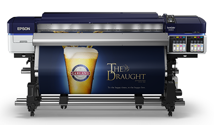
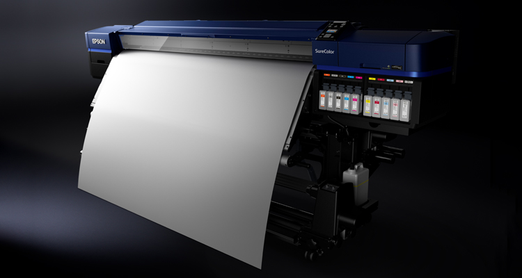
Last year I wrote a review describing my initial experience with the newest Epson Solvent SureColor S-Series printer, the S60600. You may recall that I could not find anything negative to write about it.

Well, I figured one year and hundreds of prints later is a good time to give everyone an update on these solvent printers. On our tech support floor, we run more than 25 different wide format machines. We typically use them to run profiles for each printer/product combination. There are times when we print on both the Epson S60600 and the Epson S80600 continuously five days straight. But the next month, we’ll only use the once or twice a week.

As a testing facility, we are a very odd user since we will have spells of not using a machine for some time, but that makes our situation prime for a review that is ideal to satisfy both types of users.

Tech Corner: Canon PRO-2000 and PRO-4000 Review

The Canon imagePROGRAF marketing message is as clear as a Canon L series lens: Photographers who use a Canon body and lens combination should be equally obsessed with print quality, and the ideal solution is a Canon imagePROGRAF PRO Series printer.

For those of you Canon shooters or fine art reproducers using Canon EOS camera bodies and L lenses, looking at these printers will seem like déjà vu. Canon used the same jet black textured surface found on its pro cameras, along with red line from the lenses (symbolizing the highest quality) through the front of the new 24-inch and 44-inch imagePROGRAF PRO Series printers.

Tech Corner: First Review of the All New Canon PRO-4000S/6000S

Great things come in small packages. The all new redesign of the Canon ImagePROGRAF Pro-4000S and Pro-6000S looks and performs as a completely different machine than the prior generations. Improved print performance and speed along with a much smaller footprint are some of the differences that make this printer stand out in its class.

Making something better than its predecessor has its challenges, but understanding what the end user wants is one of Canon’s designers’ strongest attributes. They have their ears open to their consumers, and this new series really proves that.

Canon cares about print quality, permanence and productivity, but also about how much space their product takes up in your shop. Out of the choices available in the market, these printers now take up the least amount of space.

VIDEOS: Top Tips for Using Canon’s iPF Series Print Plug-in

Today’s tips and tricks blog relates to printing shortcuts for the Canon iPF Series Print Plug-in. We created a series of quick videos to walk you through each process, which include universal page set ups, setting paper presets, using the adjustment pattern setting and printing borderless and with no spaces.

Universal Page Set Ups: Get away from doing a different page set up for every image printed.  This tip is particularly helpful when using roll media through any Canon printer.  When you are using the “No Spaces Top or Bottom” button you can make Universal Page sizes for the common roll widths you use.  Watch this video to see how.

Setting Up a Paper Preset: Learn how to create presets for your materials.  If you are switching between several different products like canvas to photo paper to banner, you can set individual one-click presets for each one.  Watch this video to learn more.

Using the Print Adjustment Pattern:  Have you had your image come out too dark, too magenta or in any way different than what appears on your screen? Use this tool to help you dial it in so that adjustments made can be used for any print moving forward without adjusting your actual file attributes.  Here’s a video to help you.

Use Borderless and No Spaces: Eliminate space on the top or bottom to produce a print that is trimmed all four sides borderless. Here’s how.

First Take: Epson SureColor S60600 Solvent Printer Review

Overview_S60

By Michael Clementi

As I’m writing this review, my mind continues to be blown just thinking about what I’ve witnessed: An eco-solvent printer that can harness incredible speed (up to 550 square-feet per hour) and quality while using only a dual CMYK ink set. Further than that, I’ve never seen a printer that can print two-pass or four-pass modes without a single ounce of banding throughout a full-color graphic … until now.

So now that I’ve wet your whistle a bit on some of the juicy details, I can underline for you what the fine people at Epson have done to bring a new revolutionary printer to the outdoor printing industry, namely the SureColor S60600.

Step 3 in Color Management: Understanding ICC Profiles and Settings

In Step 1 of the color management to-do list we discussed how the quality of your monitor impacts the precision of your output. In Step 2 of 3 we focused on understanding how printer and media choices affect color. The final step includes learning about ICC profiles and settings as well as some tips and tricks for viewing the print.

How do we get our monitor, which uses RGB values to project your image, to translate to our printer, which uses CMYK values? How do profiles work? And why is following the settings LexJet provides with the profiles so crucial to the accuracy of your results?

Custom Color Profiling
Figure 1 shows the 1,728 patch printout used to make a custom profile.

When LexJet creates a profile, we cover a wide range of specific printer models and LexJet media choices so our customers do not have to go through the time-consuming process of making their own profiles for each product/printer combination.

A Profile is Born
We first start by choosing a media type in the driver or plug-in, depending on which printer the profile is for. This lays down a platform for the rest of the profile to be built upon. If you get this wrong when using the profile your results will show a big discrepancy from the monitor to your print.

We give you this media type and settings to use with every profile we make and each will vary by printer and material type.

The process uses a chart of 1,728 patches, which are printed to that specific media choice with those specific settings. Each color patch has a mathematical color value set by the International Color Consortium (see Figure 1).

The patches are then run through a spectrophotometer, which then measures the actual values of those colors with that ink and media combination. The software creates a correction curve for that media to reach the closest color in CMYK language that the printer can produce. A profile is born!

To find out how to download and install ICC Profiles, check out the following videos:

Download and Install ICC Profiles – PC

Download and Install ICC Profiles – Mac

Rendering Intent and Lighting
In the process of making profiles there are colors that are out of gamut since you are converting projected light values (RGB) to reflected light values (CMYK). The way the printer determines how to handle those colors is called a Rendering Intent. To read about the different rendering options and what they mean, visit our prior post: How to find the right rendering intent.

For the purposes of this article we’ll generalize by advising you to stick to just Perceptual or Relative Colorimetric. There is an overall theory that Perceptual is usually best for semi-matte, satin or glossy surfaces and Relative Colorimetric is best for matte surfaces. If you want to be specific to each image, use the soft proofing technique to see which looks best on that specific image.

Another point to be made here is that Perceptual tends to produce smoother gradations in color while Relative Colorimetric stays truer to the original color when rendering.

Now that you have your monitor correctly calibrated, you have an understanding of your printer and media you are using and you can comfortably say you are using the right profile, rendering intent and settings. We’re now ready to click print! So here are a few valuable pointers on viewing or presenting your print…

If you’ve come this far you are obviously concerned at the accuracy and quality of the print. How you display a print can be equally as important as all of the steps we just provided on the production side. Light temperature can add another wrench into the color management mix when viewing a print for accuracy.

The print will look different under a cooler light source (fluorescent) than a warmer light source (Tungsten). So, if you have calibrated for 5500 K on your monitor but are viewing it in a warmer light the colors on the print would look warmer than on your monitor.

Keeping lighting consistent will help you judge accuracy in fairness. In a perfect world your workspace would have daylight-balanced bulbs (5500 K) installed and you would block out any exterior light sources that would interfere with the temperature of the light around your work computer. Your monitor would be calibrated using the same daylight 5500 K setting.

It’s not often we find customers working under such tight constrictions but those that do are less likely to find discrepancies when comparing the soft proof to print.

This leads to the next question: “What if I don’t know what light my customer is displaying the final product under?” Well, that is subject that you can educate your customers about! Providing them with a document that underlines proper care of the print and proper lighting instructions will only back up the fact that you are their printing expert. That should be part of the reason they go to you and not the guy down the street.

Here’s an example of the lighting instructions you can provide your customer: Placing your print under daylight balanced bulbs with minimal varied light interference will give the audience the most accurate depiction of the original art/photo.