Prints that Win: Waiting for You

Waiting for You

Each portrait Kristi Elias creates is a unique work of art that is relevant and appropriate to its subject. Last year, Elias won a Sunset Print Award at the Professional Photographers of California state competition for You Won’t Bully Me, a grungy portrait of a young martial arts competitor.

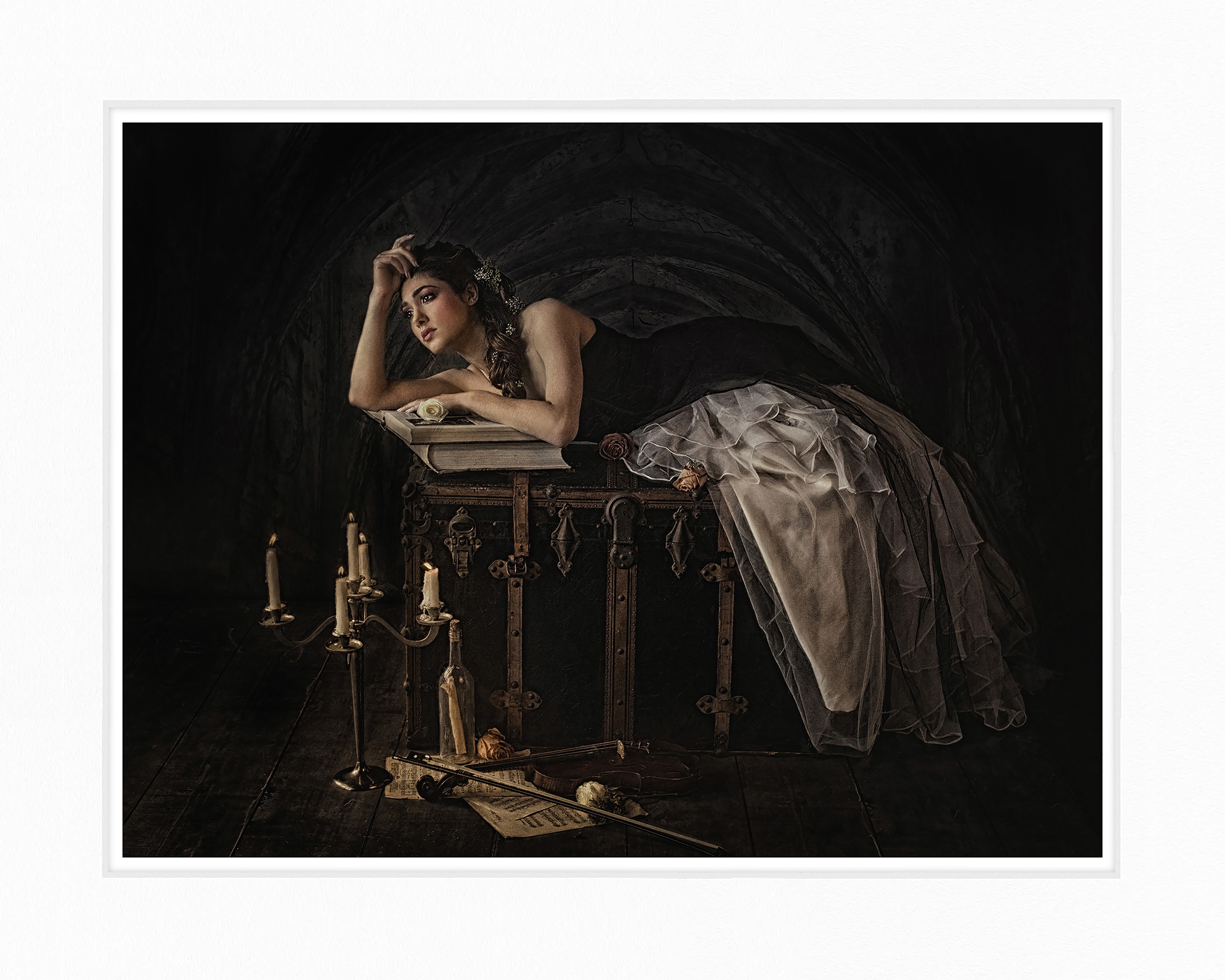
Elias followed up this year, taking home another Sunset Print Award at the California competition for a decidedly different subject, entitled Waiting for You. This portrait purposely evokes Renaissance art.

“I wanted a painterly feel with a lot of detail in the props, like the bottle. There’s note in the bottle, and you can see the contours and the detail. There was a lot of time put into those details of the portrait. You can see even the music on the floor, and all the shading and detail in it. I did it just like it would have been as a Renaissance painting, and how they paid so much attention to detail on all the props,” explains Elias.

The portrait of her client, who also poses for Elias to spark modeling ideas, was captured in the studio. Elias purchased a custom dress from Bulgaria for an authentic touch.

Elias added a new background, a photo she took of a Gothic cathedral in Tuscany. She used Photoshop, Nik Software and Alien Skin to edit the image.

“When I edit I don’t use the same actions every time. I look at each portrait as its own piece of art. Some of it is my own custom actions, and some of it is edited with Nik Software to bring out the detail in the shadows. I like to put a lot of detail in the shadow for that hopeless romantic look. I took any painterly effect off of her skin so there’s no texture on the skin, because that doesn’t go well with judging,” says Elias.

Master printer Jonathan Penney, Center Moriches, N.Y., printed the image on a fibre-based paper to complete the beautiful, Renaissance-style portrait.

Vote for Your Top Wide Format Imaging Products in the Readers’ Choice Awards

Readers’ Choice Top Product AwardsVoting starts today for Wide-Format Imaging magazine’s Readers’ Choice Top Product Awards. Click here to vote for the products that have “caused the most excitement in the industry and have been a valuable asset to wide-format print service providers’ (PSPs) businesses over the last year.”

In other words, LexJet and Sunset products, which were nominated in the following categories…

Wide-Format Imaging’s Top Products Awards will recognize the products that are doing the most for a PSP’s bottom line, including: wide-format printers, wide-format media, laminating equipment, inks, RIP software and scanners. Voting ends on Feb. 13.

Don’t forget to vote! Go to https://2015wfitopproducts.questionpro.com/

Winners will be announced at the International Sign Expo in Las Vegas, April 8-11, and featured in the April issue of Wide-Format Imaging magazine.

Video: Large Format Stills from Motion at Ori Media

Ori Media, based in Salt Lake City, tells multi-media stories, capturing motion and producing high-quality stills on a Canon iPF8400 large format inkjet printer.

Ori Media utilizes a Canon workflow that integrates a Canon EOS-1D to record 4K video and print beautiful printed stills.

Ori Media Canon iPF8400“Shooting hybrid is the only way to go. If you can shoot a video and generate stills from that at the same time, you’re going to save time and generate more revenue by upselling the client on the stills you’re pulling from the video,” says Ori Media’s founder Michael Ori. “They’ll have a cohesive campaign with photos that match their video, a 4K video that’s broadcast-ready, all within an hour.”

The video above demonstrates Ori Media’s workflow, and how quickly the company can shoot a scene and take stills from that scene to generate magazine proofs, for instance, or saleable wide format inkjet prints.

“While he’s still shooting I can already be generating deliverables. I can start editing a short video, pulling the TIFs straight from Premiere Pro into Photoshop and do some retouching,” says Joey Jonaitis, 1st AC/AD for Ori Media. “It’s great you can be sitting there with a client, checking each single frame – you have 24 frames every second – and get the perfect exposure and the perfect look the client wants, export straight to the printer with the imagePROGRAF plug-in… and you can have large-format prints right away.”

Printing Historic Art for the Historic Otesaga Resort Hotel in Cooperstown

Otesaga Resort Hotel Decor by Creative Interior Imagery

When you hear (or read) “Cooperstown,” the first thing that comes to mind is the National Baseball Hall of Fame located in this historic New York village.

Printed Decor by Creative Interior ImageryHowever, Cooperstown is steeped in American history far beyond baseball, not the least of which is its most famous son, James Fenimore Cooper, who penned the classic America novel The Last of the Mohicans (the town is actually named after his father).

Given the rich history of the area it was entirely appropriate for the historic Otesaga Resort Hotel in Cooperstown to enrich its interior décor with reproductions of fine art housed at the Fenimore Art Museum.

The hotel, which was established in 1909, turned to Creative Interior Imagery to faithfully reproduce the fine art pieces in the guest rooms and bathrooms. Creative Interior Imagery produced a total of more than 800 framed prints ranging from 13″ x 22″ to 20″ x 32″ for the Otesaga Resort Hotel.

Creative Interior Imagery Fine Art ReproductionCreative Interior Imagery is known for its ability to take a project from conception to completion, providing end-to-end capabilities from high-end photography and scanning to printing, finishing and installation, all in a tightly-controlled, color-calibrated system.

In this case, the Fenimore Art Museum scanned the original artwork and provided Creative Interior Imagery with the files, which were printed on Sunset Velvet Rag 315g on the company’s Epson Stylus Pro 11880 and Epson Stylus Pro 9900 wide format inkjet printers.

“They wanted a premium-quality archival paper for the high-end artwork. Based on that, we used the Sunset Velvet Rag: it’s been much more consistent for us than other similar fine-art papers,” says Keith Tomkins of Creative Interior Imagery. “We use it quite a bit for high-end artwork, and we’ve been getting very consistent results with it. People like the look, texture and feel so it’s been a very good product for us.”

Artisan Craftsman Books on Sunset Photo Canvas Paper

Artisan Craftsman Books

As the name implies, Artisan Craftsman Books specializes in hand-crafted fine-art photo books. Owner Larry Crandall is also a veteran photographer of 30-plus years who knows how photography can be maximized in a photo book.

Wedding Book by Artisan Craftsman Books
Larry Crandall of Artisan Craftsman Books used Sunset Photo Canvas Paper for the page spreads inside the book and a portion of the cover. He used a protective spray on the cover and placed the book inside a clamshell case to showcase it and provide additional protection.

As a fine-art photo book maker, Crandall typically uses matte paper, and most often LexJet Premium Archival Matte Paper, for the photo pages within the book. “We specialize in matte, giclee-printed books; we don’t do photographic or press-printed books,” adds Crandall.

With the introduction of Sunset Photo Canvas Paper 230g, Crandall may have found a new staple for his photo books, not as a replacement, but as an excellent textured option. He tried the new paper for the first time on a wedding photography book that was also printed on Premium Archival Matte.

Wedding Book Cover“I’m not laminating the Sunset Photo Canvas in order to let the texture show through. Instead, I spray it with a protective spray and I think it’s durable enough. It’s pretty neat looking; it has a matte, fine-art finish and I really like it,” says Crandall.

The pages are printed on an Epson 7890 as a full-page spread. Crandall uses the auto-cut feature on the printer to make it easy to stack up the sheets in order, then trims the edges and scores the middle of the spread so that the pages are ready for binding. This particular wedding book is about 50 pages, or 25 full-page spreads, all printed on Sunset Photo Canvas Paper.

Artisan Craftsman Books Wedding Album
A close-up showing both the detail and texture achieved with Sunset Photo Canvas Paper.

“I was concerned that the texture might take away from the detail, where it runs over someone’s eye or other facial feature. That’s not the case. It still prints beautifully,” says Crandall. “You get a little better continuous tone from Premium Archival Matte in certain areas. What I like is the texture itself, which has a nice feel. A large part of these books is the touch and feel, which doesn’t apply as much when you hang it on a wall.”

Prints that Win: Billy Wright

Billy Wright by Tim Kelly

Simple and clean is the philosophy that has been the cornerstone of award-winning veteran photographer Tim Kelly’s success. Kelly’s philosophy is perfectly illustrated with this Sunset Print Award-winner, a portrait of up and coming singer/songwriter musician Billy Wright.

Kelly won a Sunset Print Award for Billy Wright’s portrait at the recent Florida Professional Photographers competition. Billy Wright’s portrait is not flashy, but each technical element is spot-on, something the judges could not possibly overlook.

“At the state competition, it was one of about 40 prints entered out of a total of around 400 images. They judged the prints first, and I can tell you from competing for 30 years that you don’t want your prints judged in the first round, because the judges haven’t found their set point and they’re very conservative early on,” says Kelly. “Getting through the first round is a good thing, especially when you’re doing work that’s not high-impact or snazzy, but is just clean. It was ultimately selected as best print of the show.”

During the session, Kelly shot black-and-white film, 4×5 film and digital, selecting one of the 4×5 shots to add to his portfolio and enter in competition. It was a back-to-basics portrait session, but all of Kelly’s portrait photography is about the doing the basics well.

“I don’t make a habit of manipulating my images, even though I’ve been doing Photoshop since the first version came out. I make sure that my look doesn’t include any trendy, faddish elements. I try to go with a stock, clean, unaffected image,” explains Kelly. “I scanned the film, touched up his face a little bit and made my image for my portfolio and competition. Simplicity proves itself when you let it. When you have the fidelity the film can give, and then making the perfect print myself, it gives me quite an edge.”

Kelly also took great care to ensure that the overall presentation with the digital border elements he created would not distract from the subject matter. Again, clean and simple is what he strives for in his work.

“I try and make sure the tonal value of the border corresponds to and enhances the existing background. I never want to throw in new textures and densities when I want your eye to go to the subject. Where do you want me to look if I’m the viewer? Don’t distract me with other pinstripes and design elements,” says Kelly. “This is just a digital add of photo edges and a background tone pulled out of the image, which I printed with a sepia feel. I’ve been a fan of warmer black and white for portraits. I don’t sell, produce or enter cold-toned black-and-white photos. I photograph people, and people need some kind of warmth.”