Epson Rings in the New Year with Q1 Mail In Rebates

Happy New Year! If you’re thinking about updating your printer to kick off the New Year, Epson is offering mail-in rebates for a number of its high-end photographic and fine art aqueous inkjet printers, as well as a three-for-one art paper mail-in rebate. The mail-in rebates listed below are good through March 31, 2011, excepting the Epson Stylus Pro 11880 (good through Feb. 28, 2011)…

Epson Stylus Pro 3880 Graphic Arts Edition: $300 mail-in rebate

Epson Stylus Pro 3880 Standard Edition w/ UltraChrome K3 Ink: $200 mail-in rebate

Epson Stylus Pro 4880 (all models): $500 mail-in rebate

Epson Stylus Pro 4900 w/ UltraChrome HDR Ink: $500 mail-in rebate

Epson Stylus Pro 7890 w/ UltraChrome K3 w/ Vivid Magenta Ink: $500 mail-in rebate

Epson Stylus Pro 7900 w/ UltraChrome HDR Ink: $500 mail-in rebate

Epson Stylus Pro 9900 w/ UltraChrome HDR Ink: $500 mail-in rebate

Epson Stylus Pro 9890 w/ UltraChrome K3 Ink w/ Vivid Magenta Ink: $500 mail-in rebate

Epson Stylus Pro 11880 w/ UltraChrome K3 Ink w/ Vivid Magenta Ink: $1,000 mail-in rebate

Epson Signature Worthy Art Paper (Exhibition Fibre and Cold Press/Hot Press Bright and Natural): Buy three, get one free mail-in rebate

If you have any questions about the rebates, or need help finding the right printer for your needs, contact a LexJet account specialist at 800-453-9538.

Putting Sedona on the Map

Though Sedona, Arizona is a worldwide destination known for its scenery, spas and resorts, it’s not well known for its coffee. That may change thanks to a unique blend created by a local Starbucks manager and a branding campaign produced by photographer/designer Bill Louf.

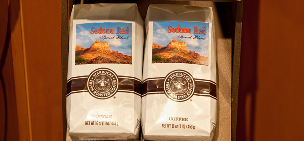
Labels on demand: Bill Louf prints on-demand labels for the local Starbucks' Sedona Red brand with LexJet Sunset Photo eSatin Paper. Louf designed the logo around his photo of Sedona's Snoopy Rock formation for this most-popular local coffee blend.

Louf owns Image Master in Sedona and was approached to help the local Starbucks, a licensed franchise located in the Hyatt, to submit one of his photographs of the iconic red rock scenery surrounding Sedona to label the new coffee blend called Sedona Red.

One thing led to another and Louf ended up not only providing his photography (a shot of Sedona’s Snoopy Rock), but his design, Photoshop and printing expertise as well. After about nine revisions, a final design was approved that included the original Snoopy Rock photo morphed with another shot Louf had taken in Utah for the sky, and the addition of coffee beans Photoshopped in the foreground.

Selecting a Monitor for Fine Art and Photographic Reproduction

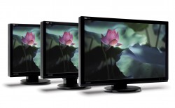
LaCie's 700 Series uses RGB-LED Backlit, which allows the monitors to achieve a significantly larger color gamut. This is a crucial ingredient in photographic and fine art reproduction.

There are three major factors that a photographer or fine art reproducer should consider when selecting a monitor: Color gamut, bit depth and calibration ability. There are other things to consider as well, such as viewing angle, contrast range, refresh rate (if doing video work), and others, depending on your business model.

Color Gamut: The rule of thumb when it comes to color gamut is that bigger is better. You can find this information by checking the spec sheet of the monitor. It should provide you with percentage of sRGB, Adobe 1998, or NTSC (similar to Adobe 1998).

If you are a photographer whose workflow only exists in sRGB, then a monitor that hits 100% of this color gamut is the best. If you primarily work in Adobe 1998, then a monitor that displays 100% of this color space is recommended. If you are using ProPhoto as your color space, then the largest color gamut technology allows is your best option.

Bit Depth: The more bit depth a monitor has, the more accurate it will render your 16-bit files. A 10-bit monitor is the bare minimum with today’s technology, with 12 being a better option. Higher bit depth improves smoothness in transitions and gradients, whereas a lower bit depth might make them appear banded. You can also find this information in the spec sheet of a monitor.

Calibration Ability: It is imperative that you can adjust three parts of a monitor’s appearance. The first of these is brightness. You should be able to adjust how bright a monitor is according to the ambient light of your studio. 120 candelas per meter squared is a good LCD starting point. The second of these is contrast. This helps the monitor achieve a desired gamma setting. Today’s standard is Gamma 2.2, and I recommend this setting. The final calibration is white point. You must be able to adjust the individual red, green, and blue channels to create custom white points. A preset white point of 6500K may, in fact, be 6300K or 6800k. You cannot trust these preset options because they many not be accurate to begin with, and may shift over time.

A great monitor choice is LaCie’s 700 series. It uses a technology called RGB-LED – Backlit. Because it is RGB-LED, it can achieve significantly larger color gamuts than any other monitor available. The 724 (24 in.) and 730 (30 in.) can achieve 123% of Adobe 1998. Also, the bit depth is now 14 bit. This is the best option for the Adobe 1998 and ProPhoto color space user.

If you are interested in getting a new monitor, please feel free to contact a LexJet account specialist at 800-453-9538 and we can figure out the best solution for your needs. 

Quick Tip: How Much is Left on a Roll?

There is a relatively simple calculation you can use to determine how much is left on a roll of inkjet printable media, based on the diameter of the roll. Here’s how to determine the amount of material left on a roll, give or take an inch or two:

Roll length in feet = (0.06545/media thickness in inches) x (outer diameter squared – inner diameter squared)

All measurements are in inches, by the way.

For example, the outer diameter of the roll (core included) is 4 inches, the inner roll diameter is 3 inches, and the material thickness is .013 inches. There are 1,000 mils per inch, so the material in this example is 13 mils, or .013 inches thick. A 7-mil material would be .007 inches thick (7/1000):

(.06545/.013) x (42 – 32)

5.03 x (16-9)

5.03 x 7 = 35.24

Roll length remaining = 35.24 ft.

Getting Creative with Inkjet Printable Wall Coverings

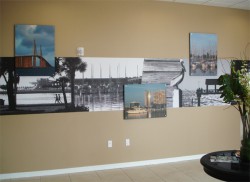
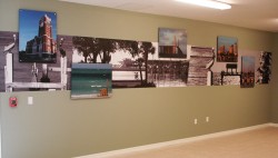
Alice June Inc., a print studio based in St. Petersburg, Fla., found a creative way to bring local color (and local black-and-white) to City Place, a new residential complex in St. Petersburg. City Place wanted to highlight local landscapes and landmarks, so Alice June and the interior designer collaborated on a wall mural concept that would provide contrast for visibility while complementing the overall design and décor of the complex.

Installed in the lobby and the club room, the finished piece features LexJet Velvet WallPro SUV wallcovering in a three-foot high strip, printed in grayscale, offset with color images printed on vinyl, laminated with a matte finish, applied to black-edge Gatorboard and mounted with standoffs about a half inch from the wall.

Alice June president, Sally Zimmermann, says the combination of color on the grayscale background, the difference in texture between the wallcovering and the vinyl images, as well as the classy and complementary look of the wallcovering with the paint scheme and finish created the exact look and feel the client was looking for.

“Because it’s a residential complex as opposed to a more commercial project, I feel like vinyl looks more commercial, so the Velvet WallPro was a great fit. They wanted something softer with a higher-end look, as well as something that would play off the color images so that you have an image and texture contrast,” says Zimmermann. “We did a similar project years ago for a commercial client, but in that case we did the opposite – we used a bright color background with the standoff images in grayscale. The opportunity to personalize a project so much and to work closely with the client to provide a creative solution that’s exactly what they need is what we really love to do.”

Zimmermann says that the quality of the original photos, shot by professional photographer Dirk Shadd, was “outstanding,” and that Shadd was a helpful partner in the process. “He made it easy for us to realize the vision and goal of our customer,” she adds.

How to Find the Right Rendering Intent

Many people who print see the Rendering Intent option and are not exactly sure what it is and how it works. They usually select a Rendering Intent option a friend or colleague tells them to use and then think nothing more of it. It turns out that this selection can have a huge effect on how your image appears, and should therefore be understood fully.

Rendering Intents are mathematical rules on how to deal with out-of-gamut colors when moving from one color space to another. In other words, chances are that when you print an image there will be colors that your camera captured that are impossible for your printer to reproduce.

The printer driver can’t just delete the sections of the images it can’t reproduce or you would get images with large sections of nothing. Therefore, the driver changes those out-of-gamut colors to colors it can actually hit. The method it uses to do this is a Rendering Intent.

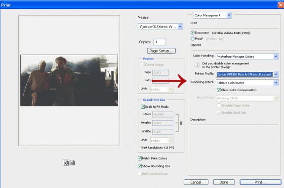
Rendering Intents in Photoshop CS3.

You may or may not have noticed that every time you hit print, there’s a Rendering Intent option. You can see it in the Photoshop CS3 print window (see the accompanying image sample). If you open up that drop-down menu you will see there are four options…