One of the most beneficial things a photographer can do as an artist is enter print competition. Not for the sake of winning awards, but to grow, learn and improve. If you look at some of the general rules that have been applied with success to images in print competition over the years, you can find some great composition and presentation lessons that make for better images.
Let’s look at using compositional cues to make sure you drive your audience to look at the part of the image that is the most important to relay the message you are trying to get across.
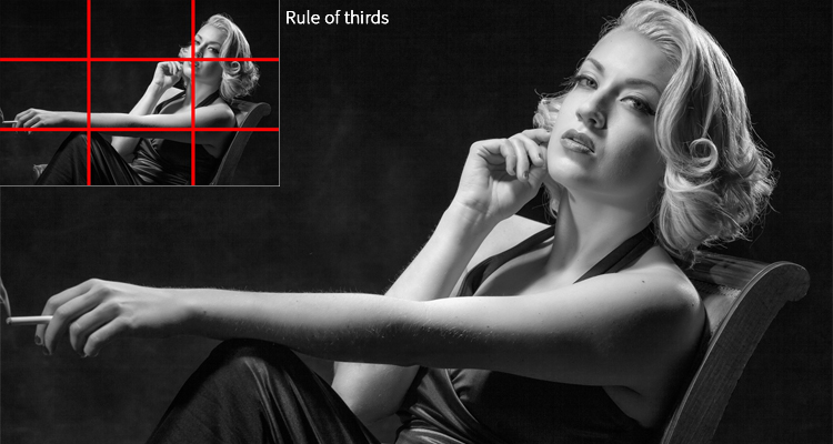
Compositionally the two most common placements of a subject in an image are based on the rule of thirds or bulls-eye. The rule of thirds, the most popular, would be like placing a tic-tac-toe game over your image, as shown above.
When looking at an image this way, make sure that the main point of interest in your image is placed on one of the crossing lines. This allows a viewer to flow through and image and helps to assure good balance, especially when there is a secondary supporting element in the image placed in the other third.
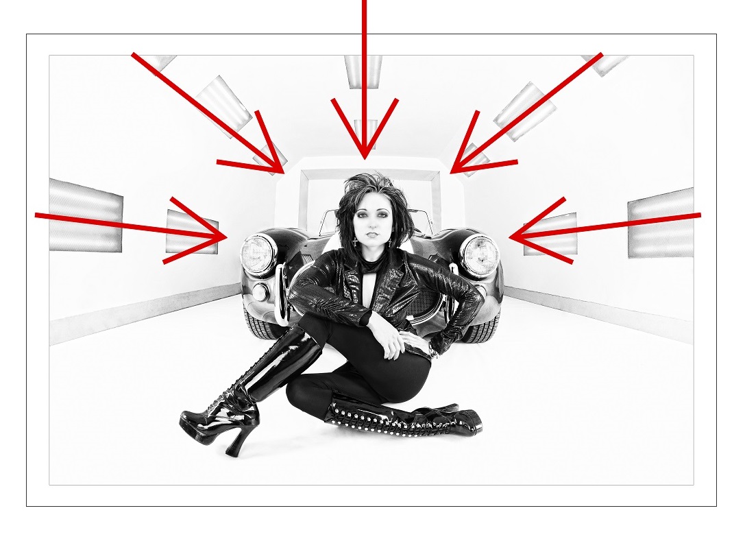
Bulls-eye composition is often looked down upon unless other compositional elements have symmetry to support this presentation. So if an image has leading lines, like a tunnel effect, then a bulls-eye effect would be great, however if there is another element in the image that isn’t symmetrical, the image can feel off balance, and a different crop might make the image feel more comfortable.
Flow in an image is also important. Because people have been taught their entire lives to read from left to right, they tend to look at images the same way. So if you are telling a story within an image, having things flow from the left to the right helps.

Even simple things like placing your subject to the left of an image looking to the free space on the right gives them space to look. However, if they were looking the other direction it would be like putting a period at the beginning of a sentence and leaving the rest of the page blank. You would hit the person’s face visually, and then not be able to follow their gaze into the rest of the image, leaving a feeling of discomfort.
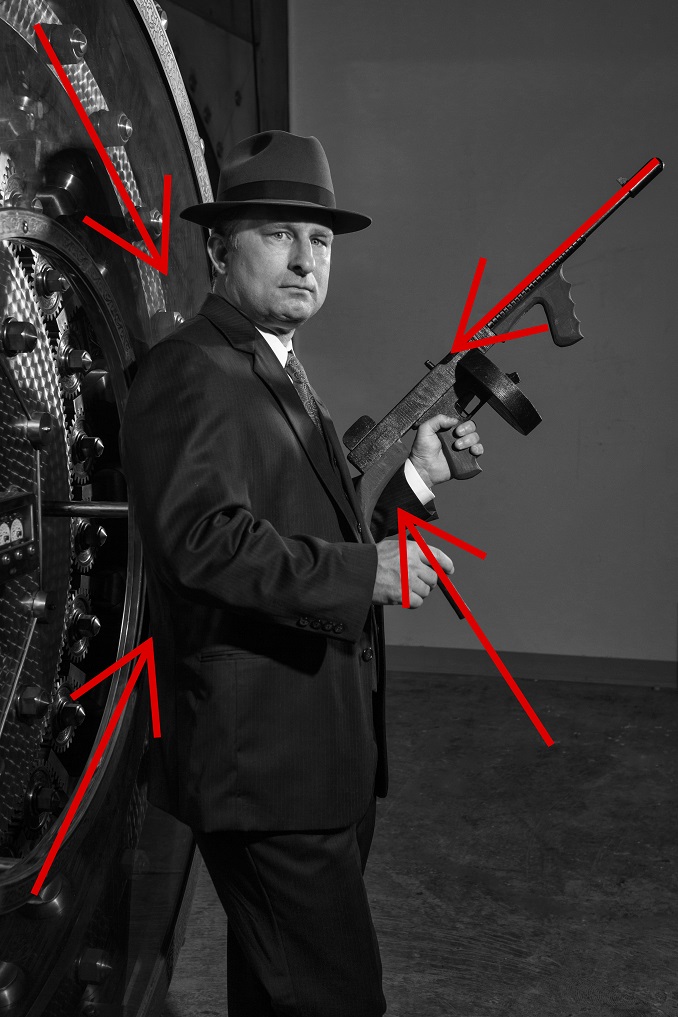
Within composition you will often hear people referring to strong diagonal, triangular or even circular composition. Diagonal composition typically refers to diagonal lines that lead back to the main subject, like a fence or rail or street.
Triangular composition typically refers to posing an image with an odd number of people and placing them in a way, height-wise, so that their heads are like a pyramid versus being in a straight line or like a totem. Again this just gives better balance to an image. Circular composition means placing elements in a image in a way that allows a viewer to flow through an image and, ultimately after working their way around it, landing back on the main part of an image.
A couple of other things to help make sure people see what you want in an image is making sure that that part of the image is the brightest. By nature, we are always drawn to the brightest part of an image. So if there are elements away from the main subject that are as bright or brighter, they will compete for the viewers attention. a simple exercise to test this out is to flip an image completely upside down and see where your eye goes. If it doesn’t go to the spot you want, then you need to address the areas where your eye does land so that they won’t compete.
Lastly would be distracting elements. When capturing an image look for elements in the background that could feel very uncomfortable if not placed well within an image. For example a tree or a lamp coming out of the top of a person’s head. Taking a step to the left or right would move those types of elements to a more comfortable spot.
Also, the horizon of an image should never cut through a person’s head or be tilted. Just by squatting lower or taking a step to a higher vantage point, you can move a person or couple to a spot in an image where the horizon isn’t cutting right through their heads or necks. In fact, keeping the entire subject either in or out of the sky in an image is the most comfortable. And if the horizon is visible in an image, make sure it is straight, having it tilted makes an entire image feel crooked and unnatural, a quick crop to straighten it out can make a world of difference.
These are just a few compositional rules that are used for print competition that might help you in your image making. The list of things that are used in print competition to help out are lengthy, but always worth looking into as they have been tried and tested over many years.