Inkjet Printing Workflow: Tiling Images for a Large Display

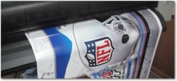
There are two methods for tiling images to create a large display. First, you can use software like Adobe InDesign, Illustrator or Photoshop to crop the image down into individual sections for print. However, the easiest and most efficient way I have found to do this for printing is in a RIP software.
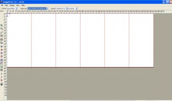
Here, I want to cover an 18-ft. wide x 80-in. tall wall. I'm printing on a 36-in. wide roll of media, so I need six tiles of 36 in. x 80 in. to complete the graphic.

Tiling is a pretty common task for the signage industry, so RIPs for that industry seem to handle tiling best. If you’re running Onyx, for example, you have a lot of control over how you tile large images.

ImagePrint, which is more geared toward photographic and fine-art printing, has a more simplistic version of tiling that will also allow you to perform this task. Think of the sign industry RIPs as more industrial for large production runs, and ImagePrint as more custom, for shorter runs in a photographic/fine-art workflow.
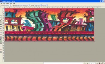
In ImagePrint, you simply fill the tiles with the image you plan on breaking up into panels, and hit print. It's that easy!

Either way, a RIP will make all the difference in the world for the quality of your images, and the efficiency and profitability of your workflow, including tiling large images together.

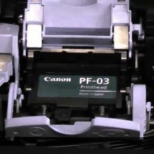
How to Replace Printheads on a Canon Inkjet Printer

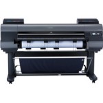
Canon printheads are rated to go through a certain amount of droplets before they need to be replaced. The printer will let you know when it’s time to replace the printhead.  When that time comes, here’s a step by step video on how to replace Canon large format inkjet printheads. Though this is a Canon iPF6100, the steps apply to all Canon wide-format printers…

Selecting a Monitor for Fine Art and Photographic Reproduction

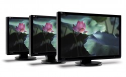
LaCie's 700 Series uses RGB-LED Backlit, which allows the monitors to achieve a significantly larger color gamut. This is a crucial ingredient in photographic and fine art reproduction.

There are three major factors that a photographer or fine art reproducer should consider when selecting a monitor: Color gamut, bit depth and calibration ability. There are other things to consider as well, such as viewing angle, contrast range, refresh rate (if doing video work), and others, depending on your business model.

Color Gamut: The rule of thumb when it comes to color gamut is that bigger is better. You can find this information by checking the spec sheet of the monitor. It should provide you with percentage of sRGB, Adobe 1998, or NTSC (similar to Adobe 1998).

If you are a photographer whose workflow only exists in sRGB, then a monitor that hits 100% of this color gamut is the best. If you primarily work in Adobe 1998, then a monitor that displays 100% of this color space is recommended. If you are using ProPhoto as your color space, then the largest color gamut technology allows is your best option.

Bit Depth: The more bit depth a monitor has, the more accurate it will render your 16-bit files. A 10-bit monitor is the bare minimum with today’s technology, with 12 being a better option. Higher bit depth improves smoothness in transitions and gradients, whereas a lower bit depth might make them appear banded. You can also find this information in the spec sheet of a monitor.

Calibration Ability: It is imperative that you can adjust three parts of a monitor’s appearance. The first of these is brightness. You should be able to adjust how bright a monitor is according to the ambient light of your studio. 120 candelas per meter squared is a good LCD starting point. The second of these is contrast. This helps the monitor achieve a desired gamma setting. Today’s standard is Gamma 2.2, and I recommend this setting. The final calibration is white point. You must be able to adjust the individual red, green, and blue channels to create custom white points. A preset white point of 6500K may, in fact, be 6300K or 6800k. You cannot trust these preset options because they many not be accurate to begin with, and may shift over time.

A great monitor choice is LaCie’s 700 series. It uses a technology called RGB-LED – Backlit. Because it is RGB-LED, it can achieve significantly larger color gamuts than any other monitor available. The 724 (24 in.) and 730 (30 in.) can achieve 123% of Adobe 1998. Also, the bit depth is now 14 bit. This is the best option for the Adobe 1998 and ProPhoto color space user.

If you are interested in getting a new monitor, please feel free to contact a LexJet account specialist at 800-453-9538 and we can figure out the best solution for your needs. 

Troubleshooting Common Printing Problems

Regardless of the wide-format printing technology used, output problems require a systematic approach that will save time, hassles, and tech calls. Here are some simple steps to help diagnose and fix the problem as quickly as possible.

Having fielded literally thousands of tech support calls for LexJet over the years it’s easy to see how little problems can become big problems rather quickly, particularly when there’s a big deadline to meet.

Maintenance Matters

Most of us already know that as our printers age, their print quality tends to drift. In addition to the printer’s age, and for lack of a better term, mileage, there are other factors that affect print quality.

Changes like new printheads, different lots of ink and media, and even environmental factors like temperature and humidity can have an impact on quality and consistency, especially over time.  In order to keep the quality of your output optimal, there are certain fundamentals that you must adhere to.

Routine Checks: While all printers are different, there are three basic steps that you can follow to maximize the quality and consistency of your output. These steps are nozzle check/cleaning, bidirectional alignment, and media feed adjustment.

Nozzle Check/Cleaning: This step seems like a no-brainer. However, many people only print nozzle checks when they see horizontal banding. It is possible to have several nozzles missing for a single color and not notice any horizontal banding, especially when printing in a high quality or high-pass print mode.

Keeping that in mind, if multiple nozzles are missing for a single color, your color may still shift. For example, if you are printing a shade of blue and you have some cyan nozzles missing, your blue may take on a purple hue. Nozzle checks should be done on a daily basis to ensure you are getting optimal print quality. If any nozzles are clogged, you should run cleaning cycles until the clogs have been rectified.

Bidirectional Alignment: In order to optimize print speeds, most shops print in a bidirectional print mode, which means that the printer lays down ink as the carriage moves in both directions. While this mode significantly increases print speeds, it also introduces the possibility of less accurate dot placement which will result in a “fuzzy” image.

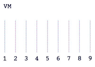
This is a target used to check bidirectional head alignment. This check was done on the Epson 11880 under Manual Alignments. Though the 11880 has the option for an auto head alignment, I printed this for demonstation purposes. After printing the target, select the number that best represents the closest alignment of the two colors. This number is then entered into the LCD display on the printer's control panel.

To ensure the highest print quality, you will want to run a bidirectional alignment calibration. This involves printing a target that typically consists of a pattern (usually a series of vertical lines) printed while the head is moving in one direction, then another corresponding pattern (series of lines) is printed above or below the first series of lines while the carriage is moving in the other direction.