The World’s Largest Photo Portfolio?

Stanley Smith Portfolio by The Image Collective
R. Mac Holbert, owner of The Image Collective in Ashland, Ore., turns the pages of the giant portfolio he built with professional photographer Stanley Smith, printed on Sunset Photo eSatin Paper. Smith’s images require this scale for accurate representation.

It may not be the world’s largest portfolio of photography, but it’s certainly one of the most unique portfolios we’ve run across, and it had to be that way. The work of veteran pro photographer Stanley Smith, who is also the Head of Collection Information and Access at The J. Paul Getty Museum in Los Angeles, requires a grand presentation to accurately display his photography in print.

Stanley Smith Portfolio by The Image CollectiveThat’s why Smith approached R. Mac Holbert, owner of The Image Collective in Ashland, Ore., to produce a giant portfolio. Holbert is a pioneer in the art of photographic and fine art reproduction. A founder of Nash Editions, Holbert is one of the most trusted sources in the nation for accurate image interpretation.

“I was hired by the Getty years ago to do some color management consulting and met Stanley there, and I’ve maintained a friendship with him all these years. About six months ago he started talking about putting together a very large portfolio because his images really need scale, and he wanted to put enough images together in one portfolio that he could take around to various galleries in the Los Angeles area,” explains Holbert. “We settled on Presidents’ Day weekend for him to come up spend three or four days here putting it together. I had been given all his files a month prior to that weekend, and was able to do the optimization on all of them and print them before he arrived.”

Stanley Smith Portfolio by The Image Collective
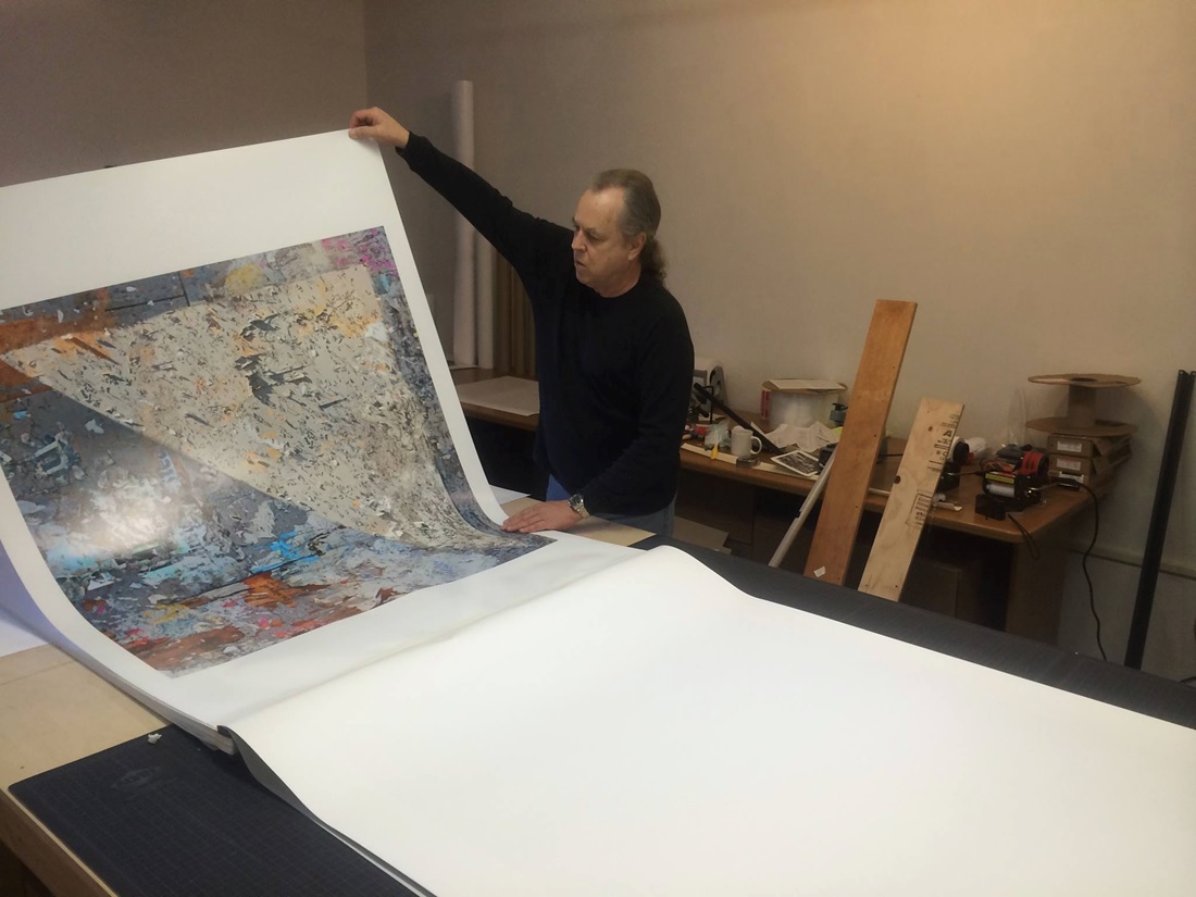
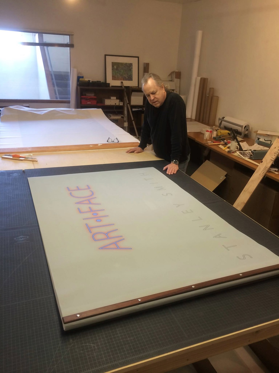
The scale of the finished piece is truly immense: 35 42″ x 60″ prints bound in canvas for a total weight of 68 pounds. The most difficult aspect of the project, according to Holbert, was binding it.

“When he arrived we had 35 prints done and spent those three days putting them together in a portfolio, and that was quite difficult. We had to attach two pieces of three-inch fabric tape on the end of each print so it would be part of the hinge and get them all lined up perfectly,” recalls Holbert. “We used a couple of rosewood strips to bind it, and a canvas cover on top and back that covered up the spine area. We finished it about two hours before his plane left. It was an enjoyable time, but a lot of work.”

Smith adds: “It was three intense days at The Image Collective working with R. Mac Holbert to, finally, complete the production of my new portfolio, and all the prints expertly enhanced by Mac, who is absolutely the best person I’ve ever met at converting an artist’s vision into pixels. Then, the daunting task of binding the book together for a final product that is really beautiful.”

Stanley Smith Portfolio by The Image Collective
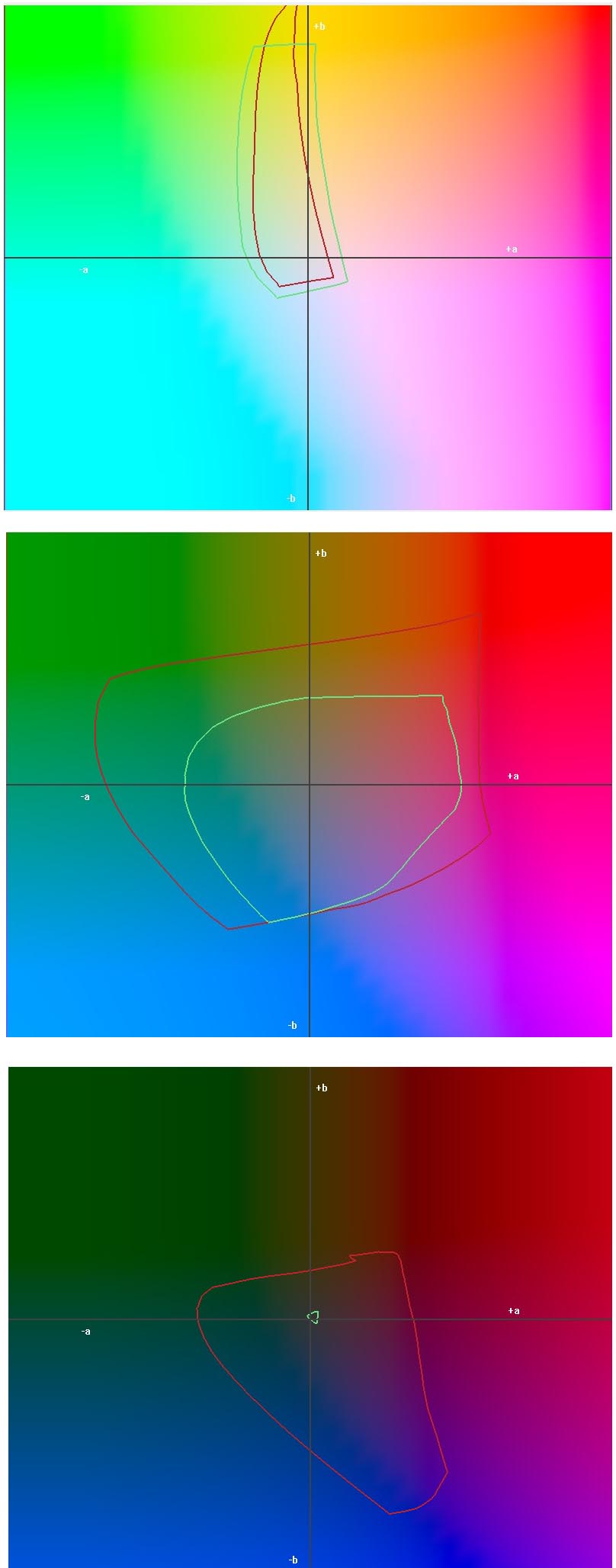
Holbert used an Epson Stylus Pro 11880 and Sunset Photo eSatin Paper for the 42″ x 60″ prints. He was looking for a thicker, more durable paper that could withstand the repeated use of leafing through the giant portfolio. Moreover, says Holbert, he wanted to maximize the color gamut and Dmax of each print.

“We were very happy with the paper; it had the Dmax and color gamut we were looking for, which can be a problem. The eSatin was spectacular,” says Holbert.

In addition to scale, Smith’s work demands the right combination of printer, paper and the eye of a seasoned print reproduction specialist like Holbert. The images Smith creates are typically built from various images shot at one scene and merge them together.

“He’ll set up his tripod and take 40-50 shots, and blend certain aspects of each image into one scene. He’s essentially compacting time into one image,” explains Holbert.

The complex nature of the Smith’s images required Holbert’s expert eye, which goes beyond simply color management techniques.

“When you’re creating world-class prints, you’re dealing in the last 2 to 3 percent of perfection. You can remove 1 percent of Cyan from an image, for instance, and suddenly it comes alive,” says Holbert.

For sharpening an image, Holbert uses a Photoshop plug-in called PhotoKit Sharpener that he says allows extremely precise sharpening, as opposed to just low, medium and high. “Those are the kinds of tools I migrate to, because anything that can give me even a 1 percent edge will make a big difference.”

Step 3 in Color Management: Understanding ICC Profiles and Settings

In Step 1 of the color management to-do list we discussed how the quality of your monitor impacts the precision of your output. In Step 2 of 3 we focused on understanding how printer and media choices affect color. The final step includes learning about ICC profiles and settings as well as some tips and tricks for viewing the print.

How do we get our monitor, which uses RGB values to project your image, to translate to our printer, which uses CMYK values? How do profiles work? And why is following the settings LexJet provides with the profiles so crucial to the accuracy of your results?

Custom Color Profiling
Figure 1 shows the 1,728 patch printout used to make a custom profile.

When LexJet creates a profile, we cover a wide range of specific printer models and LexJet media choices so our customers do not have to go through the time-consuming process of making their own profiles for each product/printer combination.

A Profile is Born
We first start by choosing a media type in the driver or plug-in, depending on which printer the profile is for. This lays down a platform for the rest of the profile to be built upon. If you get this wrong when using the profile your results will show a big discrepancy from the monitor to your print.

We give you this media type and settings to use with every profile we make and each will vary by printer and material type.

The process uses a chart of 1,728 patches, which are printed to that specific media choice with those specific settings. Each color patch has a mathematical color value set by the International Color Consortium (see Figure 1).

The patches are then run through a spectrophotometer, which then measures the actual values of those colors with that ink and media combination. The software creates a correction curve for that media to reach the closest color in CMYK language that the printer can produce. A profile is born!

To find out how to download and install ICC Profiles, check out the following videos:

Download and Install ICC Profiles – PC

Download and Install ICC Profiles – Mac

Rendering Intent and Lighting
In the process of making profiles there are colors that are out of gamut since you are converting projected light values (RGB) to reflected light values (CMYK). The way the printer determines how to handle those colors is called a Rendering Intent. To read about the different rendering options and what they mean, visit our prior post: How to find the right rendering intent.

For the purposes of this article we’ll generalize by advising you to stick to just Perceptual or Relative Colorimetric. There is an overall theory that Perceptual is usually best for semi-matte, satin or glossy surfaces and Relative Colorimetric is best for matte surfaces. If you want to be specific to each image, use the soft proofing technique to see which looks best on that specific image.

Another point to be made here is that Perceptual tends to produce smoother gradations in color while Relative Colorimetric stays truer to the original color when rendering.

Now that you have your monitor correctly calibrated, you have an understanding of your printer and media you are using and you can comfortably say you are using the right profile, rendering intent and settings. We’re now ready to click print! So here are a few valuable pointers on viewing or presenting your print…

If you’ve come this far you are obviously concerned at the accuracy and quality of the print. How you display a print can be equally as important as all of the steps we just provided on the production side. Light temperature can add another wrench into the color management mix when viewing a print for accuracy.

The print will look different under a cooler light source (fluorescent) than a warmer light source (Tungsten). So, if you have calibrated for 5500 K on your monitor but are viewing it in a warmer light the colors on the print would look warmer than on your monitor.

Keeping lighting consistent will help you judge accuracy in fairness. In a perfect world your workspace would have daylight-balanced bulbs (5500 K) installed and you would block out any exterior light sources that would interfere with the temperature of the light around your work computer. Your monitor would be calibrated using the same daylight 5500 K setting.

It’s not often we find customers working under such tight constrictions but those that do are less likely to find discrepancies when comparing the soft proof to print.

This leads to the next question: “What if I don’t know what light my customer is displaying the final product under?” Well, that is subject that you can educate your customers about! Providing them with a document that underlines proper care of the print and proper lighting instructions will only back up the fact that you are their printing expert. That should be part of the reason they go to you and not the guy down the street.

Here’s an example of the lighting instructions you can provide your customer: Placing your print under daylight balanced bulbs with minimal varied light interference will give the audience the most accurate depiction of the original art/photo.

Step 2 in Color Management: Printer and Media Color Gamut

In Step 1 of the color management to-do list we discussed how the quality of your monitor impacts the precision of your output. Step 2 of 3 focuses on understanding how your printer and the inkjet media choices affect color.

Print accuracy doesn’t rely solely on your use of a custom profile and an accurate monitor, though these two components guide you toward the closest possible result. There are two additional variables that can have a big impact on the types of colors you can hit with any printer…

The first is the gamut of the printer. How an ink is formulated in order to print a Coca-Cola red or a Pepsi blue, for example, may differ slightly from technology to technology.

These days I field a lot of questions about choosing between an 8-color system and a 12-color system.  Or, should I use the 9-color or the 11-color printer? Is there a noticeable difference between them?

The answer is yes, there is a noticeable difference any time you add colors. However, the next question I usually follow up with is, “What are you using the printer to print?”

When considering printing technology, there are printers made for higher-speed production (HP Z5200, Canon S Series, Epson T Series, to name a few) that can print a sellable photographic image, but would not be the ideal to use for an artist, photographer or fine art reproduction house. These printers have fewer inks, which cuts down on gamut but improves on speed in most cases.

If you’re in the market for a printer, talk to a LexJet customer specialist and explain the market you are in. We will make sure that you are using the right equipment for the job.

If you are seeing a color that is in your photograph or art piece that you just can’t nail with your printer, it may be out of gamut for the printer or out of gamut for the media you chose to print to.

If you’ve calibrated the monitor, make sure your printer is running at 100 percent capacity, that you’ve soft-proofed the image with the chosen rendering intent, and used a specific printer profile to print. If it still doesn’t portray what’s on your screen, then either of the above mentioned may be at fault.

Now I just spit out a bunch of jargon that may be foreign to you, so click on the links to the tutorials here to find out more…

Download and install ICC Profiles:

PC: http://www.youtube.com/watch?v=8W-F-k8z5io

MAC: http://www.youtube.com/watch?v=vuOhztAqoyY

How to Softproof before Printing using Photoshop:

http://www.youtube.com/watch?v=ahf9yEPO4zA

How to print using ICC Profiles (find your printer and computer combination):

http://www.youtube.com/user/LexJet/search?query=Printing+Through

Color gamut difference between a gloss and matte photo paper.
Figure 1 shows the difference in gamut between a gloss and a matte paper in the high, mid and low range of color (top to bottom). The gloss paper is our Sunset Gloss Photo Paper (red line) and the matte our Premium Archival Matte Paper (green line) as profiled on the Canon IPF8400 with the X-Rite DTP70. Click on the image for a larger version.

You can’t do anything to increase the gamut of the printer, but you can make the right decision based on your needs at the time you purchase the equipment. Making sure you use the right equipment for the type of work you are doing will dramatically increase the quality of your print.

Our second extremely important variable to understand is the media with which you choose to print. The less reflective the media, the less light that reflects back into your eyes, and therefore, the lower the gamut and detail your print will realize (see Figure 1).

Artists have come to love matte watercolor papers and canvas, yet always demand the best color on those surfaces. This is where the owner or production manager at a fine art reproduction house runs into the biggest conflict.

The reflectivity of your media is not the only aspect of the printable supplies that affects color outcome.  White point can change your gamut as well. The brighter the white point, the more gamut you’ll pick up, not to mention an increase in that lovely term the experts like to use, Dmax, which is the darkest measurable value your printer-media combination can hit.

For canvas, Sunset Select Gloss Canvas has the highest dynamic range and color gamut of the canvas offerings LexJet produces. The highest-gamut matte canvas is our Sunset Select Matte Canvas, which has a very punchy white base. Partnering the Sunset Coating line with Sunset Select Matte Canvas has been a very popular choice amongst artists and photographers.

If you are trying to appease the artist crowd who prefer fine art papers, the highest-range matte paper is Sunset Fibre Matte (a very smooth bright-white fiber cellulose paper). If you need 100% cotton with a smooth finish, Sunset Hot Press Rag will be close behind.

If they would like texture on their cotton paper our latest addition to the line is Sunset Bright Velvet Rag.  This paper has the highest Dmax of our cotton line and prints very elegant-looking velvet-textured prints.

On the photographic side of media options, all of our bright white glossy and semi-glossy fibre-based papers put out a phenomenal range. They are all meant to emulate different versions of old-style air dried chemical bath papers that film photographers were used to exposing in the darkroom. These papers include Sunset Fibre Gloss, Sunset Fibre Elite and Sunset Fibre Satin.

Our newest paper in this category is Sunset Fibre Rag, which is 100% cotton and has a warm tone to the base. Even though it is warm in tone, the range is very large and the texture is very fitting to that style of paper.

For RC photo-based paper replicas, nothing tops the gamut of the Sunset Photo Gloss Paper. It reflects the most light, has a high-gloss wet-looking surface like one you would receive from a photo lab providing chemical-style glossy prints.

Also ever so popular for printers looking for a beautiful thick luster paper (e-surface) is our Sunset Photo eSatin Paper. This paper has a very cool white point and the surface is the most popular amongst the RC-emulating class of papers.

LexJet will provide you with the ICC profiles for every media above mentioned. If we do not list one here for your technology we will happily make one for you free of charge! Next time, we’ll tackle Step 3 in the color management to-do list: understanding ICC Profiles and settings. In the meantime, feel free to call us any time at 800-453-9538 with questions.

SGIA Offers Free Webinars for Graphics Providers in 2014

SGIA has released its 2014 schedule of free Webinars, which SGIA says presents unique information and fosters important discussion about industry topics in 60 minutes or less.

SGIA WebinarsThe upcoming Webinars cover a variety of topics, including: Business management, sales advice, 3D printing techniques, color management, garment decorating methods, setting up and creating screen printing artwork, wide-format dye sublimation, installing window films and more.

The 2014 Webinar series starts with the session Finding Savings Before & After the Print on Jan. 15 at 2 p.m. ET. SGIA’s Dan Marx will moderate a discussion panel between industry experts on the topic of how companies can differentiate themselves and carve out a competitive advantage by looking to become leaner and seeking new profit opportunities.

Here’s the SGIA Webinar schedule in 2014…

  • 3D Embellishment Technologies: Jan. 29
  • Way To Grow: Feb. 12
  • Who is Responsible for Correct Color? Feb. 19
  • Water Based Garment Inks: Feb. 26
  • Creative Art for Screen Printing: March 5
  • Seven Highly Effective, Low-Cost Marketing Habits: March 12
  • Top Ten Sign Code Considerations: March 19
  • QC for Curing of Screen Printing Inks: April 9
  • Steps for Wide-Format Dye-Sublimation Success: April 16
  • Pricing the Print: April 23
  • What is Your Break-Over Point? April 30
  • Navigating the “Green” Jungle: May 7
  • Selecting the Right Sales Compensation Plan: May 14
  • UV LED Curing Case Studies: May 21
  • Understanding and Installing Window Films: June 11
  • OSHA Came to Call – And Found A Problem! June 18
  • Digital Textile Finishing Technologies: June 25

All Webinars are subject to change and free unless otherwise noted. Webinars are 60 minutes long, beginning at 2 p.m. ET and broadcast online. A complete schedule can be found at SGIA.org.

X-Rite Announces Free November Webinars

Free Color Management Webinars from X-RiteX-Rite Photo Marketing announces its schedule of free November 2013 webinars developed to address specific photography and color management topics and are designed to appeal to both professional and serious amateur photographers.

Producing Your Own Magazine Style Book with Sally Wiener Grotta, 1-2 p.m. ET, Thursday, Nov. 7: In this webinar Sally shares the workflow for creating a gorgeous glossy magazine-like journal for her American Hands project. From choosing the photographs, to preparing them, controlling the color with X-Rite solutions, and preparing the final layout for printing. Attendees will receive special webinar offers.

To register for the free webinar, go to: https://www2.gotomeeting.com/register/772229162

Getting the Shot: A Conversation with Nature Photography Icons Marc Muench, Rick Sammon and Andy Williams with presenter Joe Brady, 1-2 p.m. ET, Thursday, Nov. 14: Three nature photography icons will discuss their techniques to be sure they come home with those “once in a lifetime” shots. Marc Muench, Rick Sammon, and Andy Williams will share some of their tips and techniques with webinar attendees in a relaxed, conversational format. They will also take questions live. Attendees will also receive special webinar offers. No pre-registration is necessary for this free webinar. Simply click on the following link and follow the on-screen instructions: http://xritephoto.com/ph_learning.aspx?action=webinars&eventid=1608&eventdateid=5644

3-part video webinar series, Part 1 – Perfect Color for Inkjet Printing with Joe Brady, 1-2 p.m. ET, Nov. 19: Host Joe Brady will cover tips and techniques to make your color workflow the best it can be for printing. No pre-registration is necessary for this free webinar. Simply click on the following link and follow the on-screen instructions: http://www.xritevideo.com/webinars/111913.asp

3-part video webinar series, Part 2 – Perfect Color for Lab Printing with Joe Brady, 1-2 p.m. ET, Thursday, Nov. 21: How to put a color workflow into place in order to get consistent and accurate results from your lab. No pre-registration is necessary for this free webinar. Simply click on the following link and follow the on-screen instructions: http://www.xritevideo.com/webinars/112113.asp

3-part video webinar series: Part 3 – Perfect Color for Fine Art Printing with Joe Brady, 1-2 p.m. ET, Tuesday, Nov. 26: Host Joe Brady explores the capabilities that the X-Rite i1Pro 2 system brings to those who have exacting color needs for printing Fine Art prints. Starting with a quick monitor calibration, learn how to produce exacting paper profiles for the absolute best color reproduction and see how to adjust those profiles for specific lighting conditions. No pre-registration is necessary for this free webinar. Simply click on the following link and follow the on-screen instructions: http://www.xritevideo.com/webinars/112613.asp

ONYX 11 Makes Life, and Printing, Easier

ONYX 11 Software
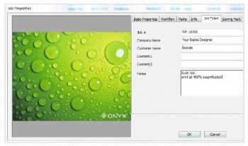
ONYX 11, the latest version of Onyx Graphics’ industry-standard RIP and color software, is now available from LexJet.

The new version includes 21 tools and enhancements designed to simplify the printing workflow, improve output predictability and ultimately increase your profitability…

Productivity Tools

  • Color Swatch Books
  • Integrated job ticketing
  • Nesting with image preview
  • Color managed previews for RIP-Queue
  • Expanded job properties window
  • Rotate jobs immediately when opening files
  • Rotate jobs directly in RIP-Queue
  • Job and key word search tool
  • Disproportionate scaling
  • Latest generation in RIP technologies
  • Enhanced cutting technologies
  • ONYX Thrive Production Manager II
  • Introducing ONYX Connect
Job Ticketing in ONYX 11
Job Ticketing is only one of 21 new features and enhancements in ONYX 11. With Job Ticketing, you can input job ID numbers, customer data and custom notes specific to the job that can be tracked and edited.

Innovations in Color

  • ChromaBoost
  • Spectral calibration
  • Specialty and spot color ink restriction
  • Improved i1 device support
  • Pause and resume color measurements
  • New quality evaluation images

If you have a current ONYX Advantage software maintenance agreement, you’re automatically eligible to get the new version. License updates are available today and can be obtained by contacting sales@onyxgfx.com. If you’ve purchased ONYX Thrive, ProductionHouse, PosterShop or RIPCenter on or after July 1, 2013, you are also eligible for this update by contacting sales@onyxgrafx.com.

For more information about ONYX 11, availability, upgrade packages, and pricing, contact a LexJet customer specialist at 800-453-9538, or go to www.onyxgfx.com/products/onyx11 to watch videos, download the ONYX 11 product brochure and to get all the details on the new features in ONYX 11.

You can also check out more specific ONYX 11 product information at the following links:

ONYX PosterShop Version 11

ONYX ProductionHouse Version 11

ONYX RIPCenter Version 11